A Colour-Coded Wallcovering Strategy for a Leading South African Bank
When one of South Africa's leading banks commissioned a complete fitout of its headquarters office floor, the brief was clear: create an environment that feels energetic, purposeful, and distinctly theirs. The solution, executed with precision and ambition across every zone of the floor, places wallcovering at the centre of the design strategy — not as decoration, but as architecture, wayfinding, and identity all at once.
What makes this project exceptional is that the wallcovering decisions were not made room by room. They were made as a system. A family of geometric wallcovering designs — all sharing the same crystal star and constellation line vocabulary — was deployed across the floor in a deliberate colour-coding strategy: each meeting room, breakout zone, and collaboration space given its own distinct colourway from the same design DNA. Walk the floor and the wallcovering tells you where you are. This is wallcovering as wayfinding — spatial identity communicated entirely through surface.
Across the suite of meeting rooms, four colourways of the same geometric design create four entirely different room personalities. A vivid magenta energises a private focus room. A deep burnt orange with gold line detail — paired with matching acoustic panels and black conical pendants — anchors a dynamic breakout lounge. A white and pale grey version with fine red line detail frames a presentation room where a large screen sits directly on the wallcovering surface. In each case the colourway sets the emotional register of the room before a single person enters it.
The main boardroom occupies a different register entirely. Here the same geometric language is expressed in deep charcoal with fine gold line detail — restrained, authoritative, and precisely calibrated to the weight of decisions made in the room. A warm oak boardroom table and black leather executive chairs complete a space that communicates gravitas without coldness. The wallcovering is the single most important decision in the room. It is what elevates it from a functional meeting space to a room that commands respect.
Threading through the geometric energy of the individual rooms, the circulation corridor takes a completely different approach. A large-format fine-line botanical mural — dense banana leaf forms drawn in precise black line on a white ground — wraps the curved corridor wall from floor to ceiling. It moves through the space at human pace, creating a moment of calm and organic contrast against the bold geometry of the rooms it connects. This is a designer decision that shows complete understanding of the floor as a whole: the botanical mural is the breath between the colour.
In the primary breakout and informal meeting zone, the full colour ambition of the project is expressed without restraint. A large-scale kaleidoscopic geometric mural — teal, navy, coral-orange, pale yellow, and light blue in bold triangular forms with white constellation line overlay — wraps a corner of the space in a composition of extraordinary visual energy. This is the room that communicates the organisation's personality most directly: confident, contemporary, and entirely unafraid of colour. The wallcovering does not decorate this space. It defines it.
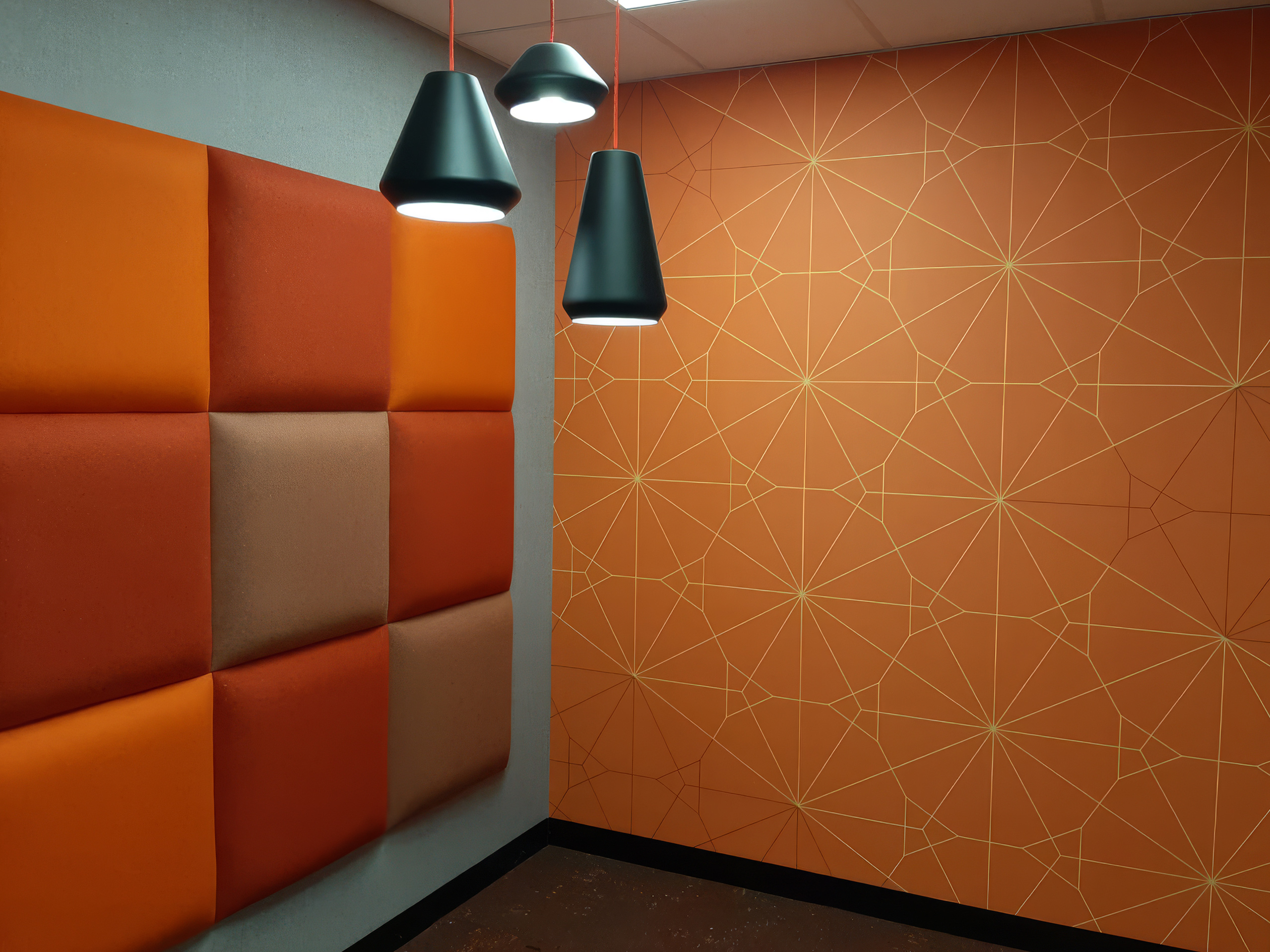
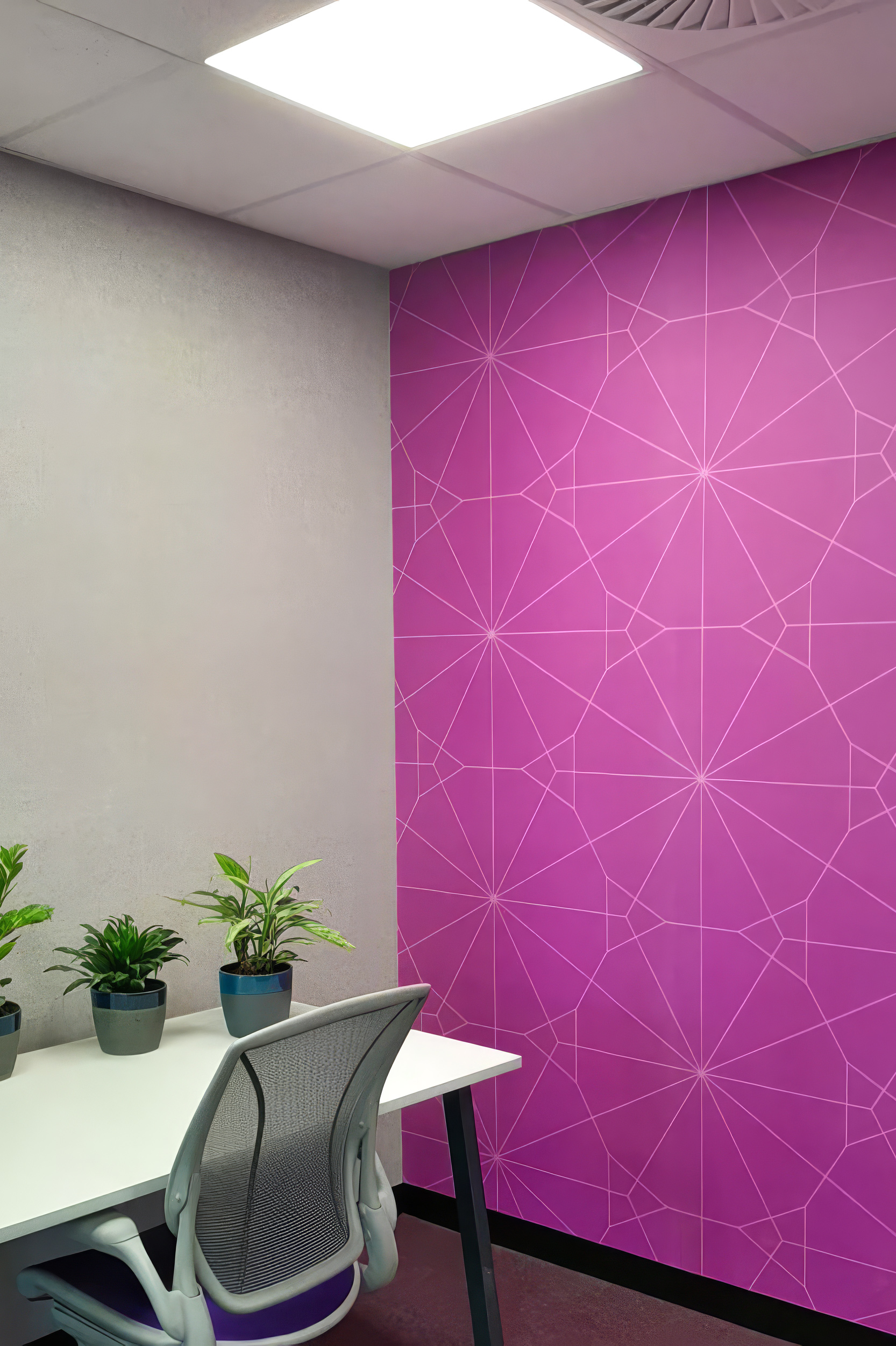
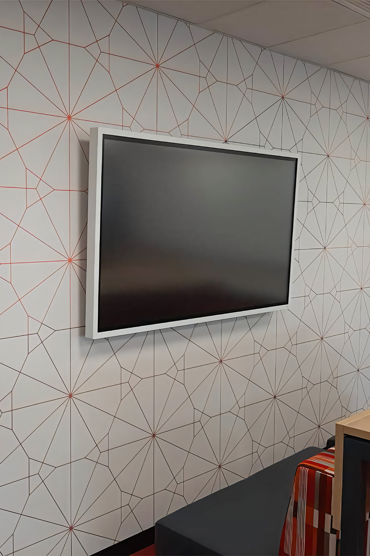
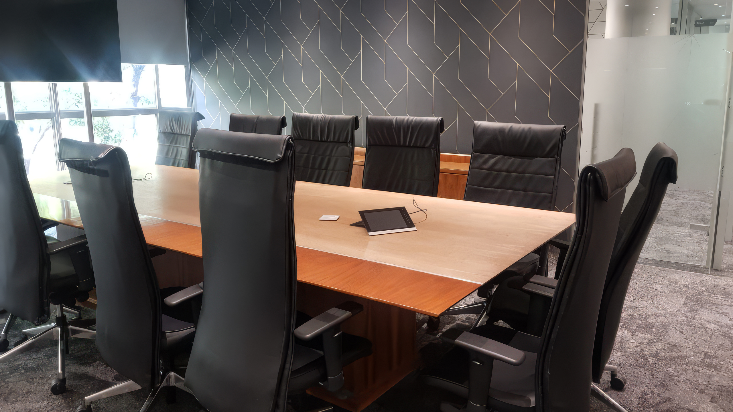
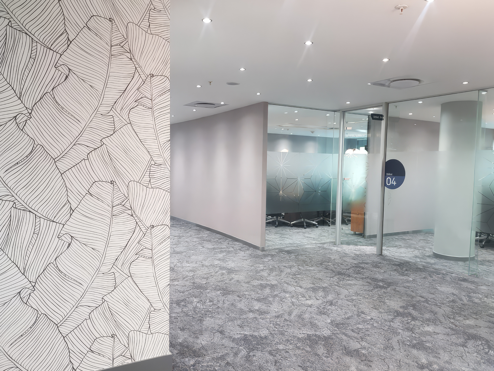
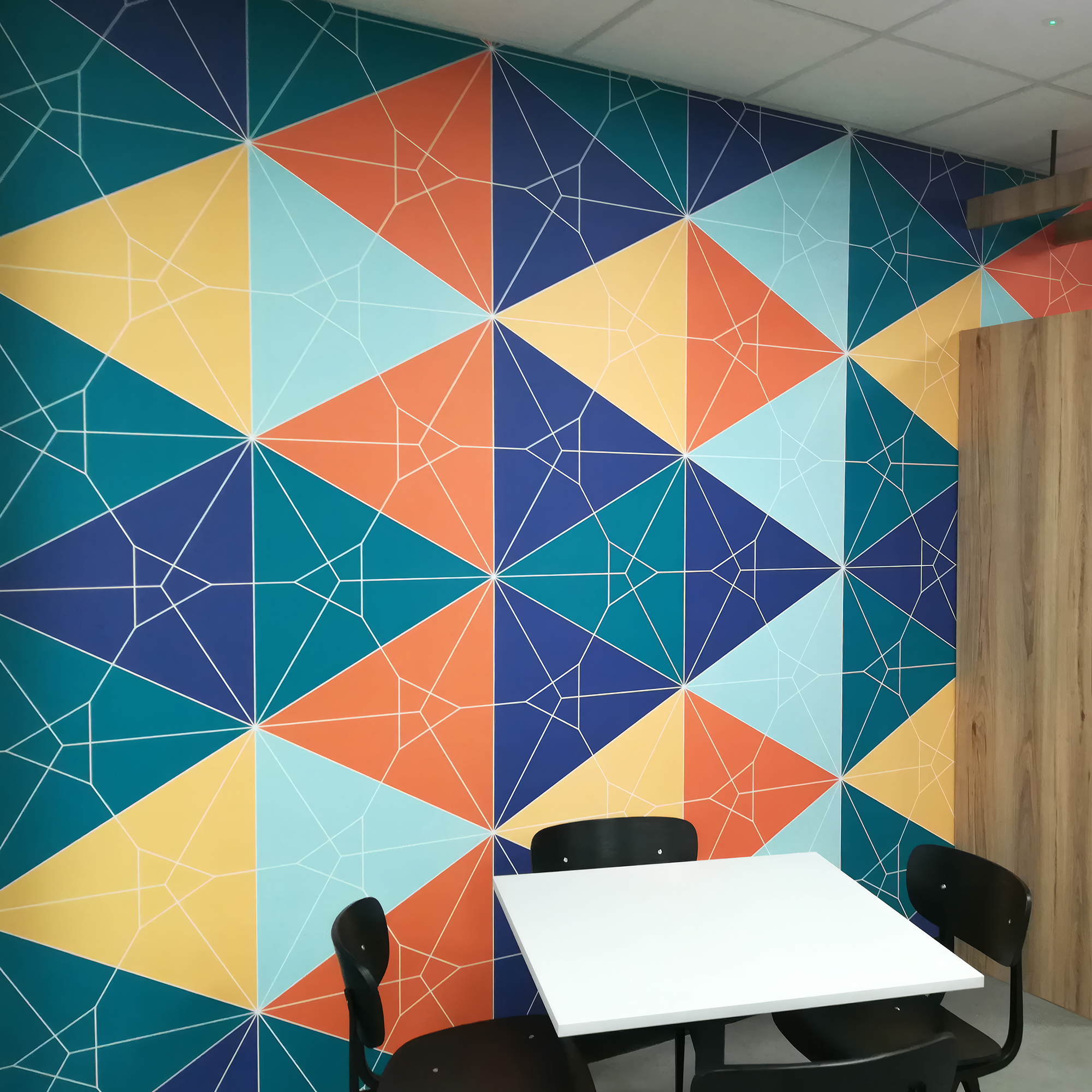
This project represents WCI Wallpapers at full commercial scale — multiple designs, multiple colourways, precision installation across an entire corporate floor, coordinated as a single coherent design system. Supplied and installed for one of South Africa’s leading banking institutions, it demonstrates that the case for considered wallcovering in corporate environments has never been stronger. The wall is never background in a space like this. Here, it is the entire design language.
