The Drawing on the Wall — Technical Illustration as Commercial Interior Design
The most powerful commercial interiors are the ones that tell you something about the people who work in them. Not through signage or branding applied to surfaces after the fact, but through the surfaces themselves — through decisions that embed the organisation's character into the architecture of the space. In this commercial office fitout by Urban Spaces, two wallcovering decisions do exactly that. And together they create an environment unlike any other in this portfolio.
On the meeting room feature wall, a large-format technical illustration mural wallcovering covers the full surface in dense fine-line mechanical drawing — complex overlapping engineering forms, pipe systems, machinery components, and architectural isometric views rendered in precise black line on a white ground. This is not a decorative choice. It is a declaration. The organisation that inhabits this space thinks in systems, builds complex things, and has the confidence to put the evidence of that thinking directly on its walls. The mural communicates expertise before a word is spoken.
In the circulation and waiting zone, the same technical illustration design appears in its second colourway — the mechanical drawing forms rendered in deep red-rust line on white. The shift in colour shifts the register entirely. Where the black version reads as precise and analytical, the red version reads as energetic and urgent. Urban Spaces has used the same design DNA to create two distinctly different atmospheres across two different zones of the same floor — a sophisticated wallcovering strategy that creates variety without sacrificing coherence.
Against the technical precision of the illustration murals, Urban Spaces places a lush living green wall — dense tropical foliage in palm fronds, ferns, and flowering plants covering a full wall panel in the meeting room. The contrast is deliberate and arresting. The drawn mechanical world and the living botanical world face each other across the same room. The tension between them is not a design problem to be solved. It is the design. It communicates that this is an organisation that holds complexity and nature in the same frame.
Threading through every surface decision in the project — from the red-line mural to the red-accented lockers to the red ambient ceiling wash to the red pedestal seats — is a colour system of complete discipline. Charcoal, white, and red. Urban Spaces holds this palette without deviation across every zone and every object. The wallcovering decisions are the largest expressions of this system, but they succeed because everything around them speaks the same language. This is what integrated design looks like at its most controlled.
What Urban Spaces demonstrates in this project is an uncommon design skill: the ability to translate an organisation's intellectual identity into physical space. The technical illustration mural is not a generic choice from a wallcovering catalogue. It is a specific decision made for a specific client — a surface that says something true about who they are and what they do. That specificity is what elevates this fitout beyond the functional and into the genuinely expressive. The wall carries the brief.
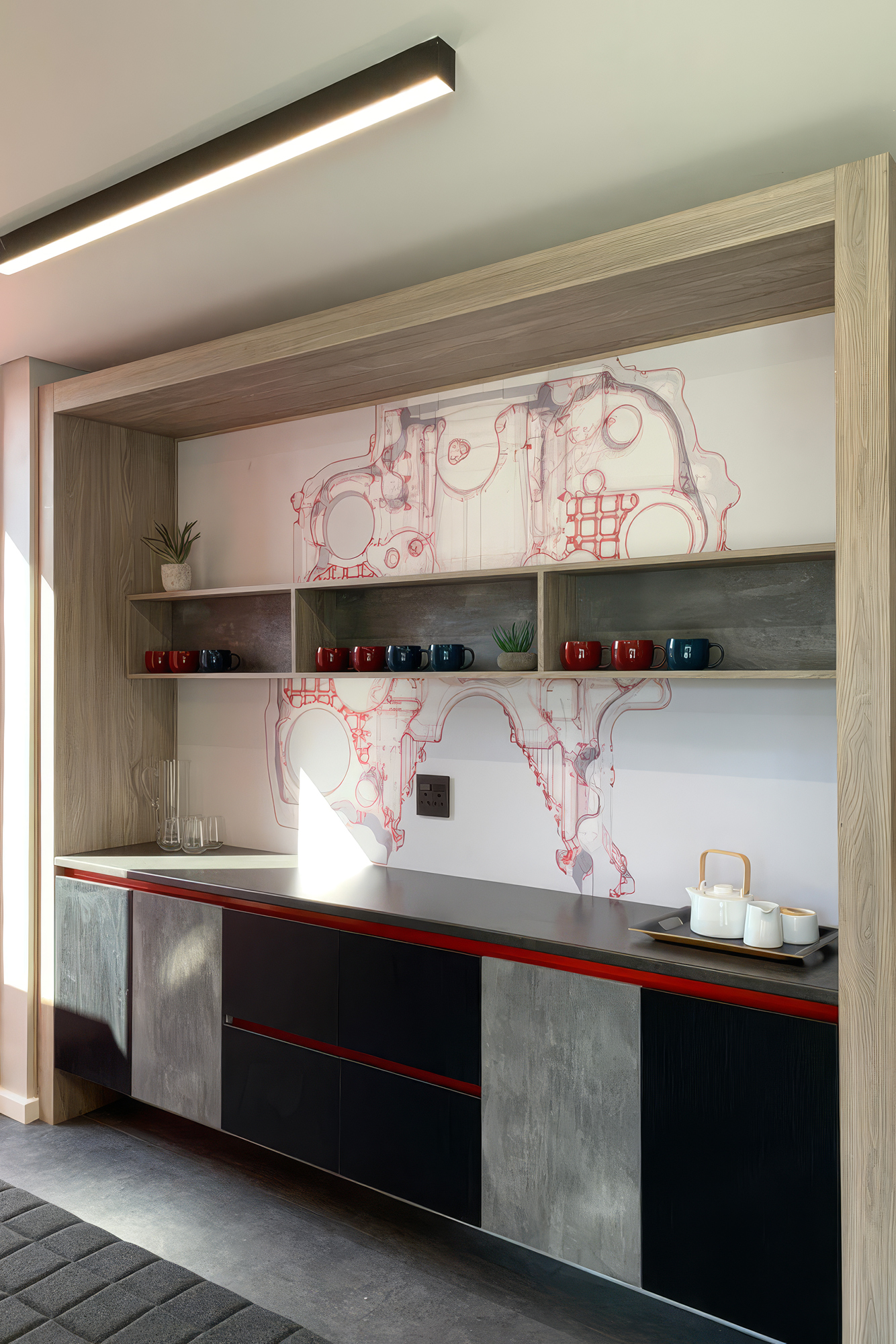
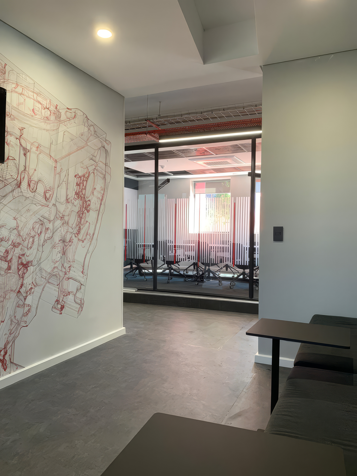
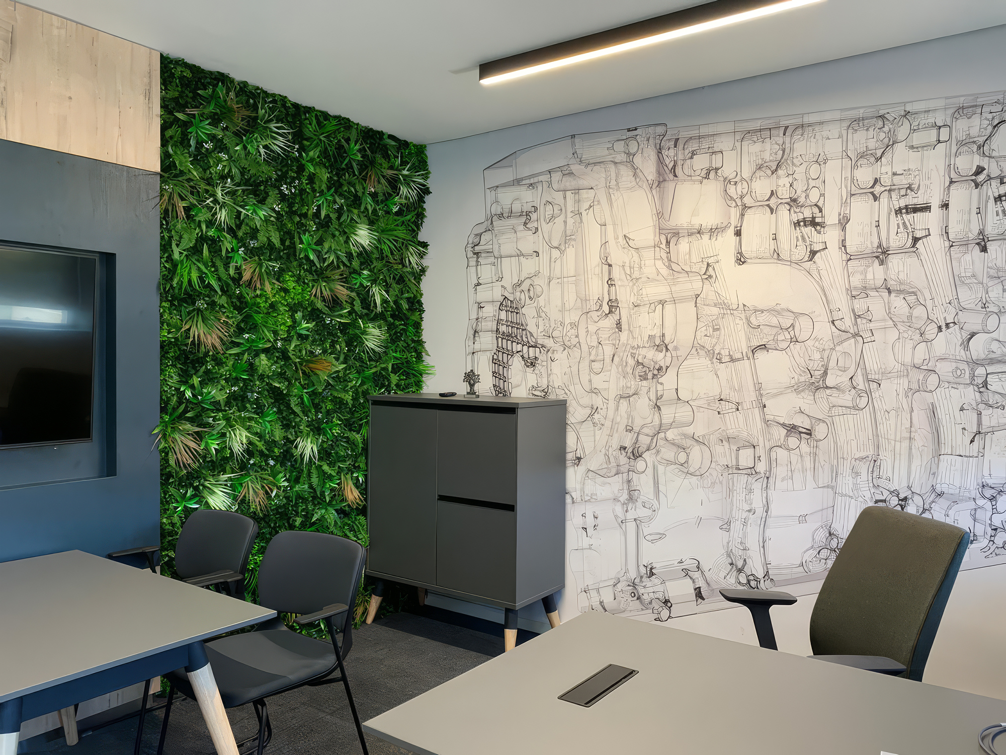
This project demonstrates the full range of what commercial wallcovering installation requires — from the precise application of large-format technical illustration murals across meeting room and circulation walls to the material intelligence of knowing when to contrast a drawn surface with a living one. Supplied and installed by WCI Wallpapers, the mural installations in this fitout prove that the wall is always the most communicative surface in any commercial space. Here, it speaks with authority, precision, and character.
