
Amber and Teal: How Yuliya Gaiduk Made the Wall the Heart of QBar
There is a moment, when you walk into QBar in Stellenbosch, where the room announces itself before anything else does — before the wine list, before the marble bar top, before the forest-green velvet of the stools. The wall announces it. Yuliya Gaiduk's design for this wine bar is built around a single, definitive wallcovering decision: a large-scale tropical botanical on a ground of deep amber that reads like burnished honey, like the inside of a barrel, like late afternoon light through a glass of Chenin. It is the architecture of atmosphere made visible, and every other material choice in the room flows from it.
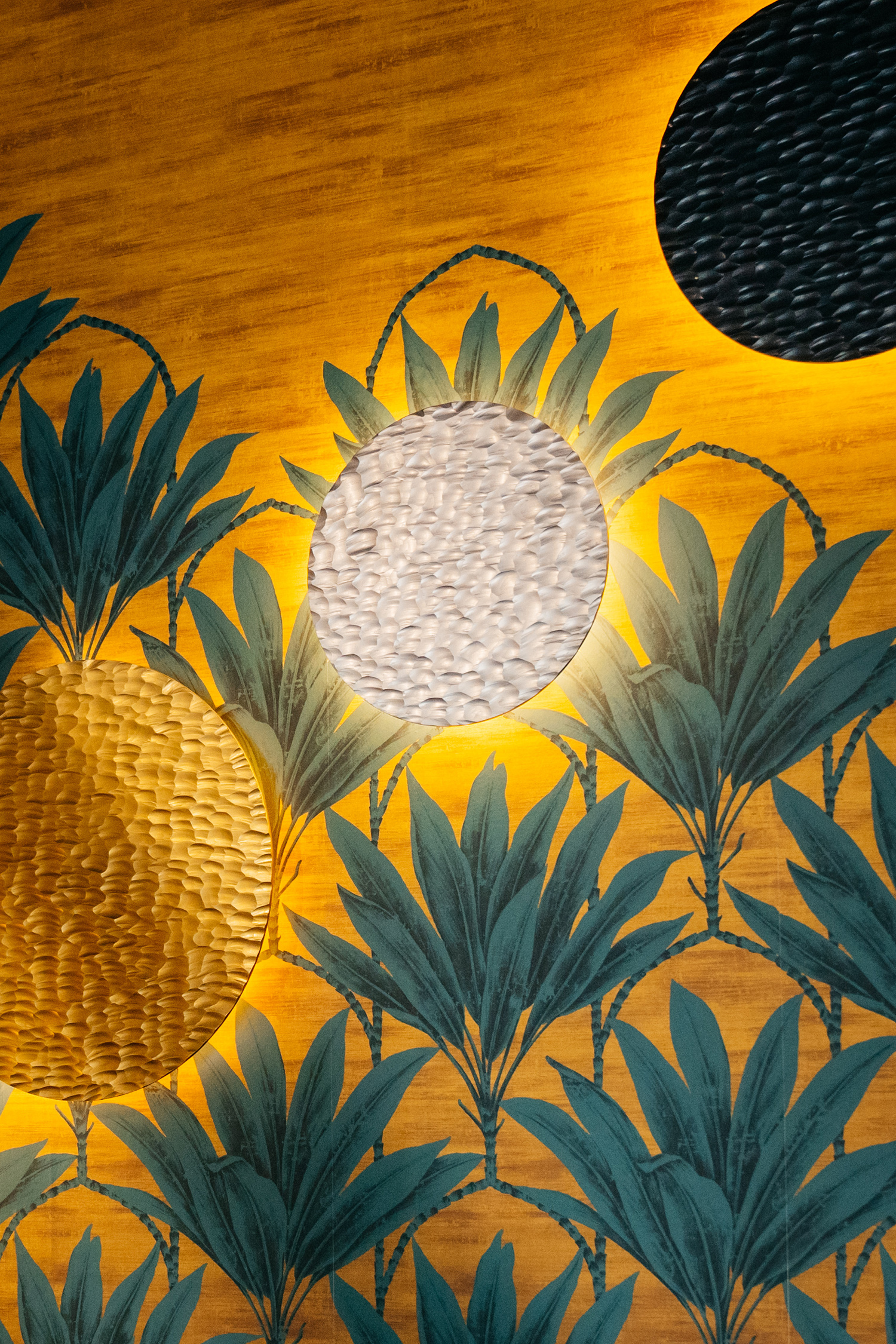
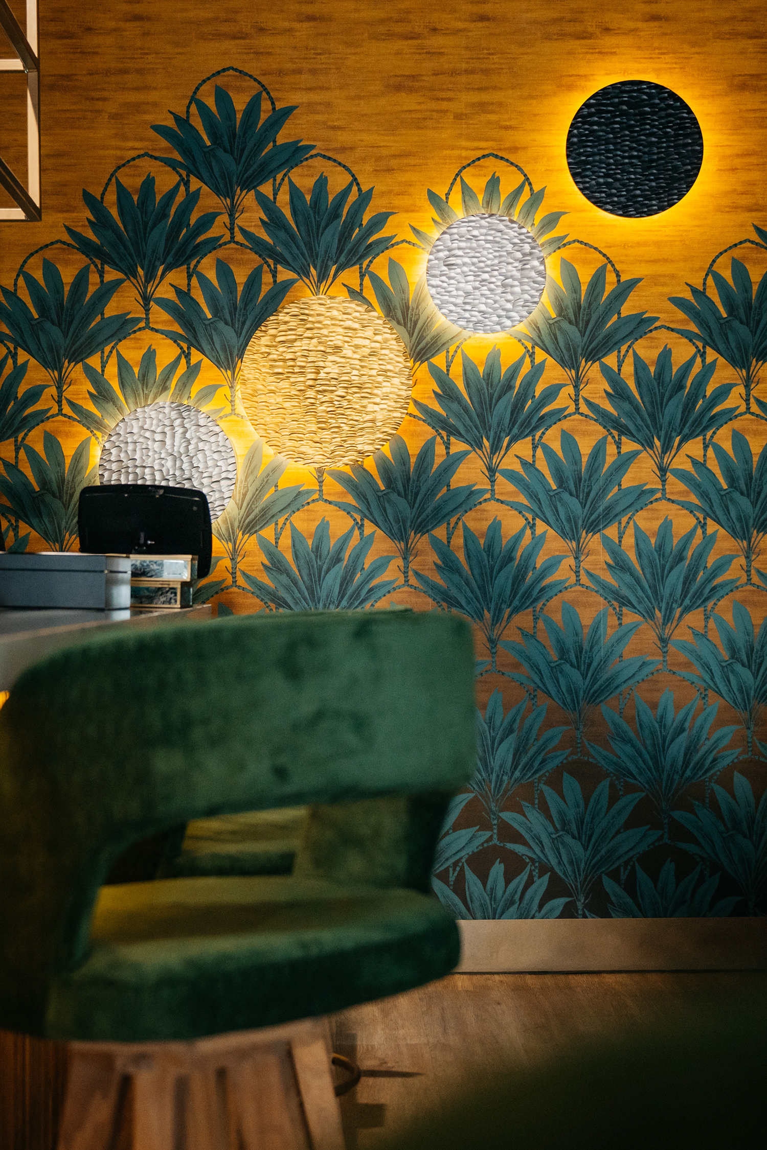
The wallcovering at QBar is not a pattern in the conventional sense — it is a landscape. Stylised pineapple plants drawn in deep teal and steel-blue fill the wall from floor to ceiling, each one rendered with the precision of a botanical illustrator and the confidence of a muralist. The scale is deliberate and significant: the individual plants stand at nearly a metre tall, crowning the amber field like a grove seen at dusk. The ground itself — with its fine horizontal grain suggesting grasscloth or a natural-fibre substrate — gives the surface warmth and materiality that a plain printed paper never could. This is a wall that has texture, depth, and temperature. It does not recede. It holds the room.
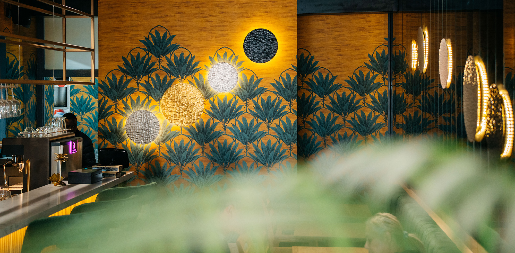
Gaiduk’s most arresting design decision was what she placed against the wallcovering, not on top of it. Three large circular woven-texture disc sculptures — one in warm natural straw, one in bleached white, one in deep charcoal — are mounted directly into the botanical field, each one backlit with a halo of warm amber. They read as celestial bodies: three moons at different phases rising from the teal canopy. The relationship between the woven discs and the woven-grain wallcovering ground is not coincidental — the amber tones echo and amplify each other, while the textural kinship between disc surface and wall surface makes the two feel like a single designed system. The wall is never background here. It is the sky these moons inhabit.
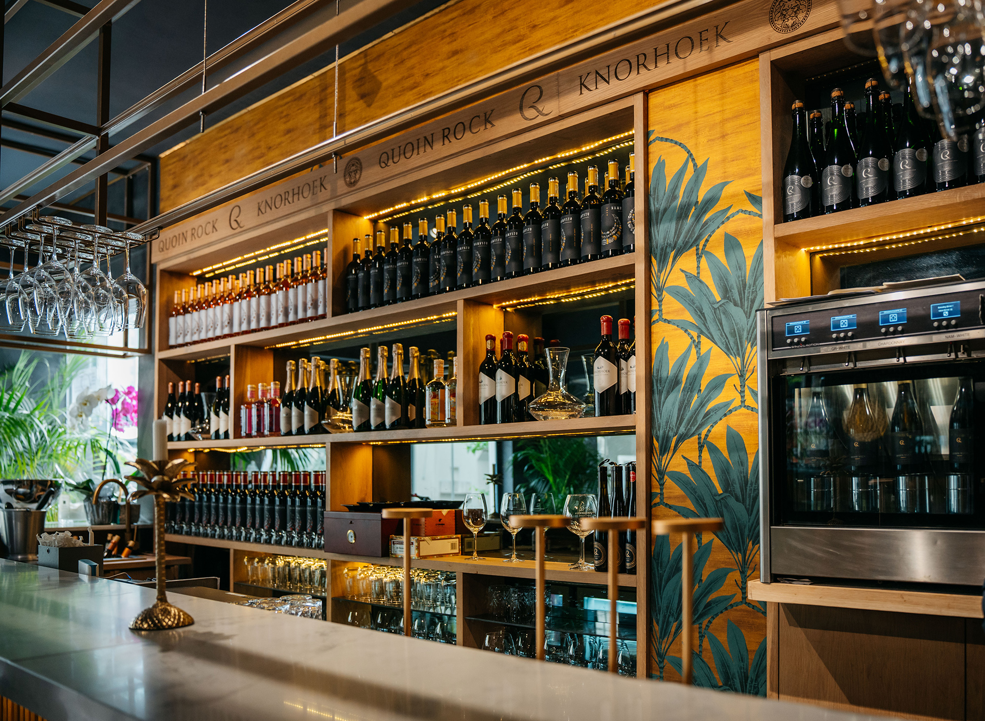
The oak shelving, the black steel framing, the marble counter, the hanging glass rails — all of it is warm, considered, and in service of the wallcovering's amber and teal palette. The forest-green velvet stools pick up the teal of the botanicals and deepen it. The brass lotus-form tap handle and the golden pineapple ornament on the bar top are not decorative accidents — they are deliberate notes in a colour system established first by the wall. Even the wine labels on the shelves, dark-toned and jewel-rich, feel at home here. Yuliya Gaiduk designed a room in which the wallcovering set the palette, and everything else had the intelligence to follow.
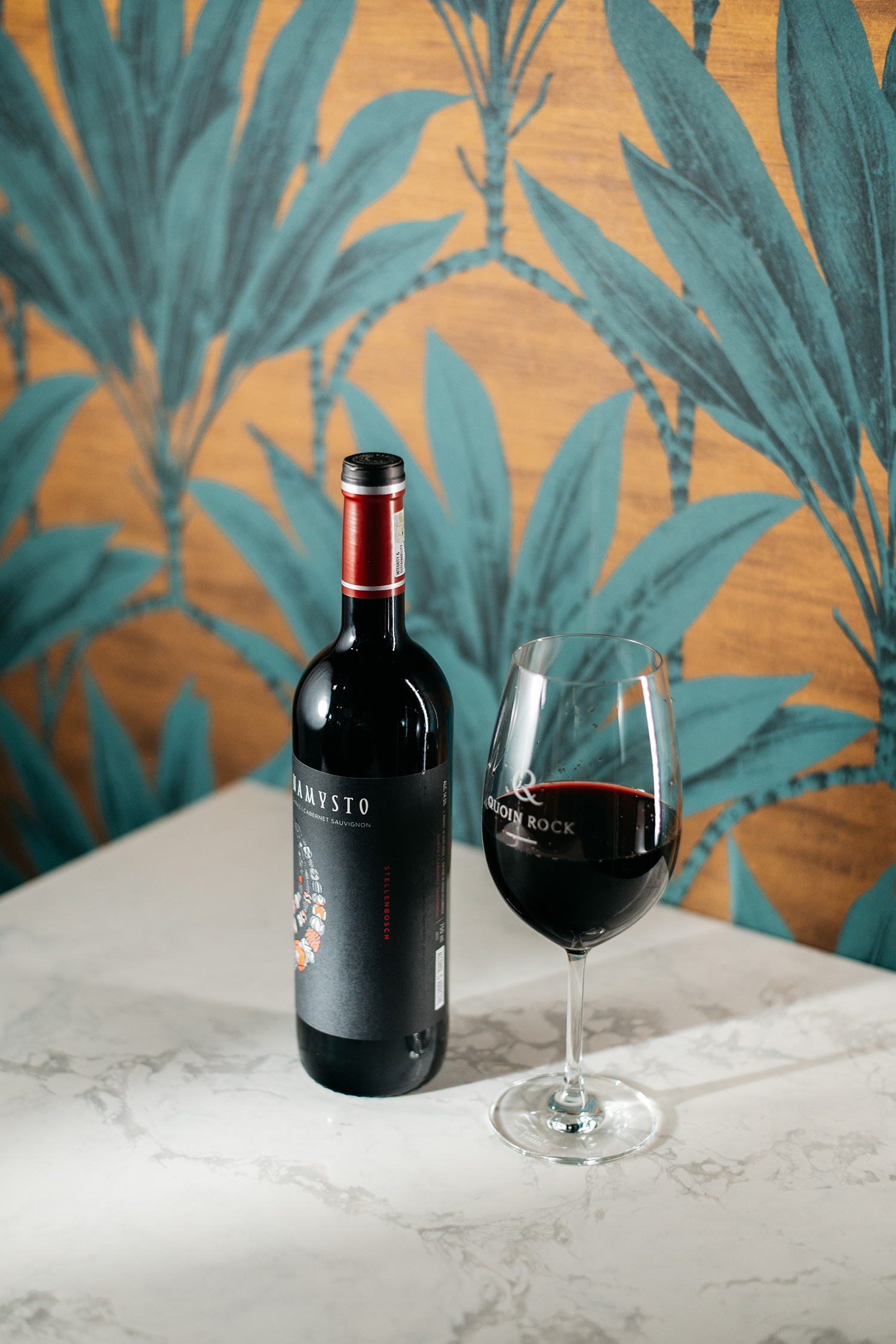
The choice of amber as the wallcovering ground is the project's most sophisticated move. Amber is not a neutral — it is a colour that carries warmth, organic richness, and an almost edible quality that is precisely right for a wine bar. It echoes the colour of aged white wine in the glass, of honey on a board, of the first press of light through oak. Against teal and deep green, it creates a complementary tension that feels simultaneously tropical and deeply South African — the colours of the fynbos coast at golden hour, translated into interior surface. In a wine-country context, this is colour theory expressed as atmosphere.
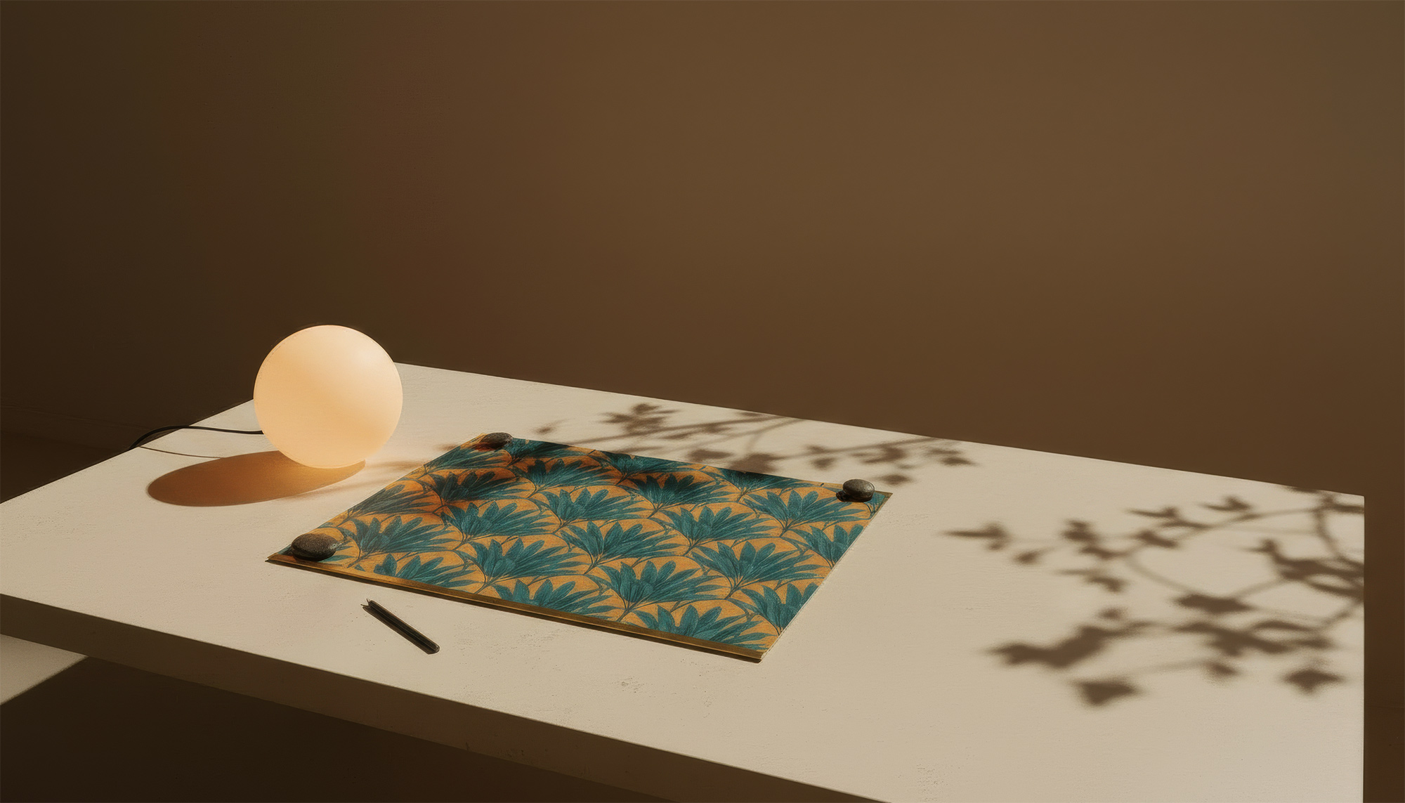
The close-up images of the wallcovering surface reveal something that the full-room shots can only suggest: this is a surface of considerable quality. The horizontal grain of the substrate reads beneath the print, giving the amber field a textile depth that changes with the angle of the light. The teal botanical drawing is clean and precisely registered — lines are sharp, gradations are controlled, and the scale is consistent across the full height of the installation. For a commercial bar that will live in this space for years, the quality of the print and substrate matters. What Yuliya Gaiduk specified, and what WCI Wall Coverings installed, was not a shortcut. It was a surface built to hold the room.
QBar is a room with a clear identity — and that identity begins at the wall. Yuliya Gaiduk made the decision, early and correctly, that the wallcovering would not be the finishing touch but the founding gesture: the element from which all other decisions — seating, lighting, shelving, accessories — would take their cue. The result is an interior that feels designed in the deepest sense: cohesive, intentional, and genuinely memorable. In the Stellenbosch Winelands, where the landscape itself is the hospitality, QBar earns its place by bringing that same sense of natural richness indoors. WCI Wall Coverings supplied and installed the full wallcovering programme — a project that confirms what happens when a designer trusts the wall.