Crystal Towers — Mapping the Boardroom

The boardroom is the room where decisions are made. It is, more than any other space in a corporate building, the room that needs to communicate something true about the organisation that uses it. At Crystal Towers, the wallcovering decision in the executive boardroom achieves this with extraordinary clarity — and demonstrates what becomes possible when a designer treats the wall as the most important architectural surface in the room.

Across the full feature wall of the boardroom, a custom-designed cartographic mural wallcovering renders a precise, fine-line map of the city in delicate white line on a deep near-black ground. Streets, road networks, urban blocks, and topographic contour lines are drawn with technical accuracy across the full architectural surface. The map wraps the corner of the room, extending across multiple wall planes. At this scale, the wallcovering ceases to be decoration and becomes orientation — a constant visible reference to the city the building stands in and the geography the organisation operates within.

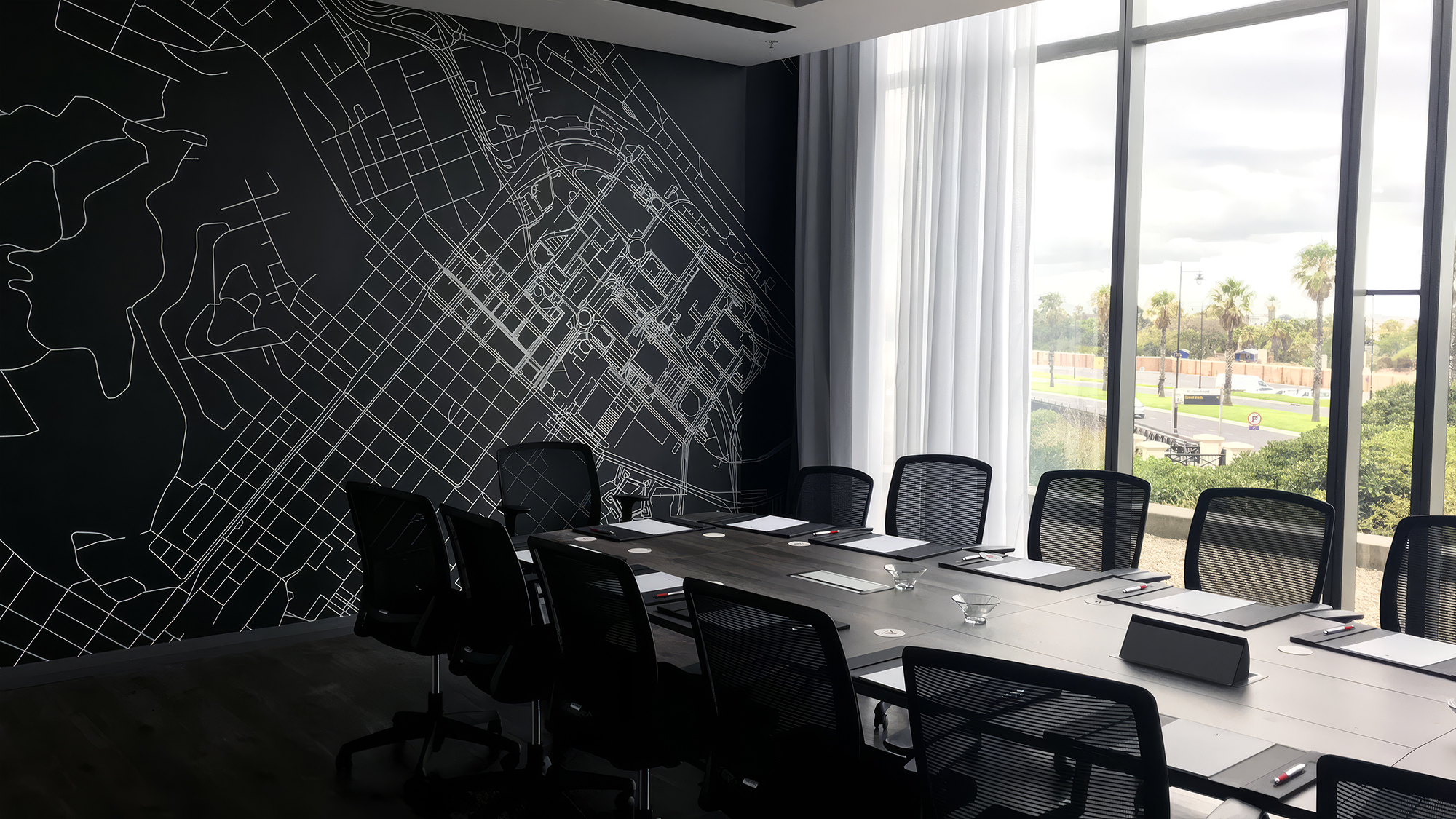
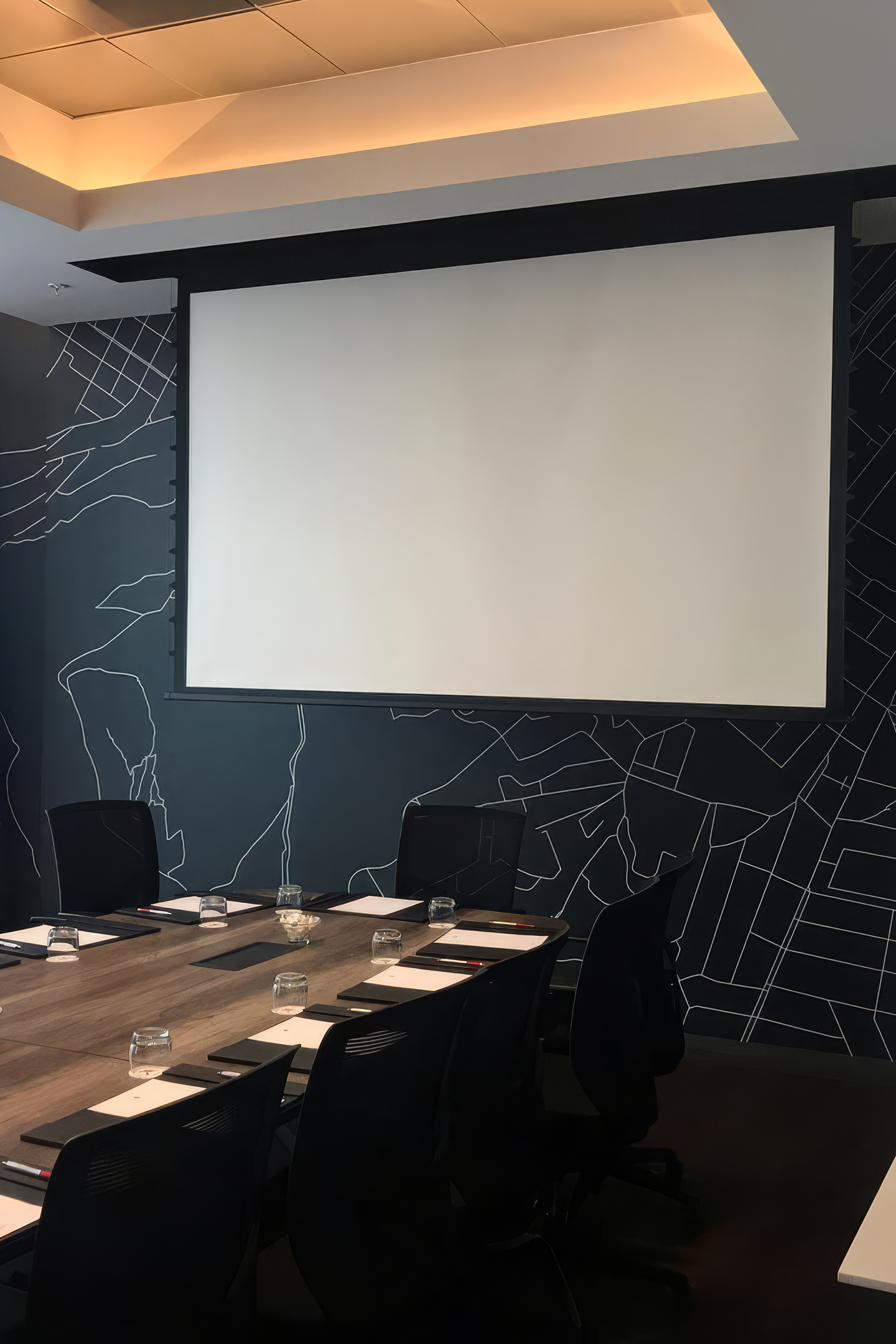
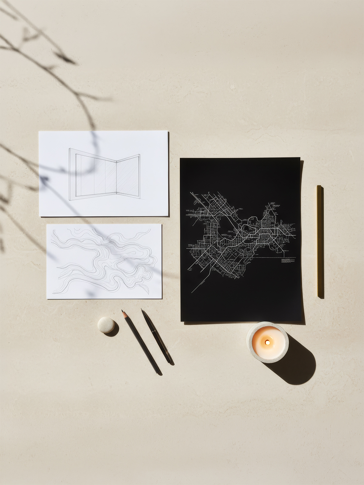
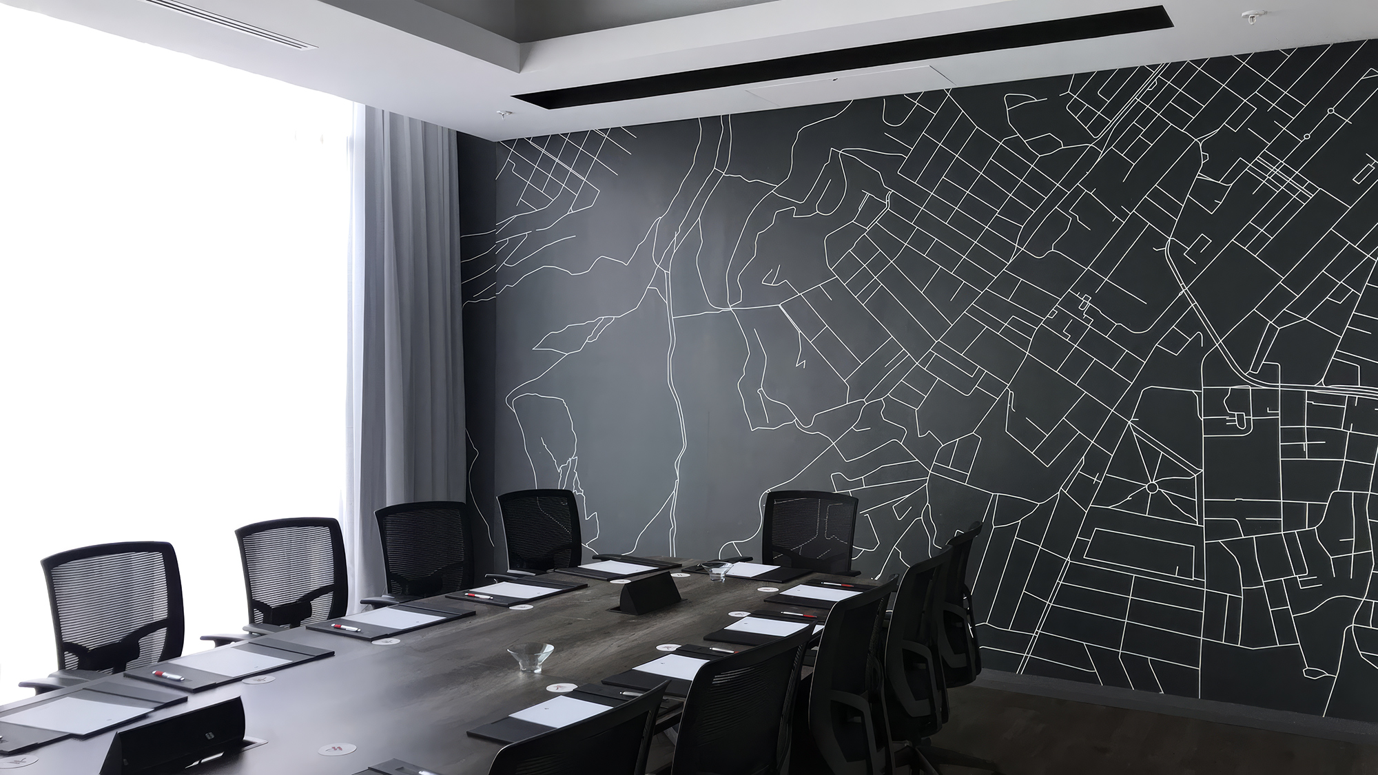
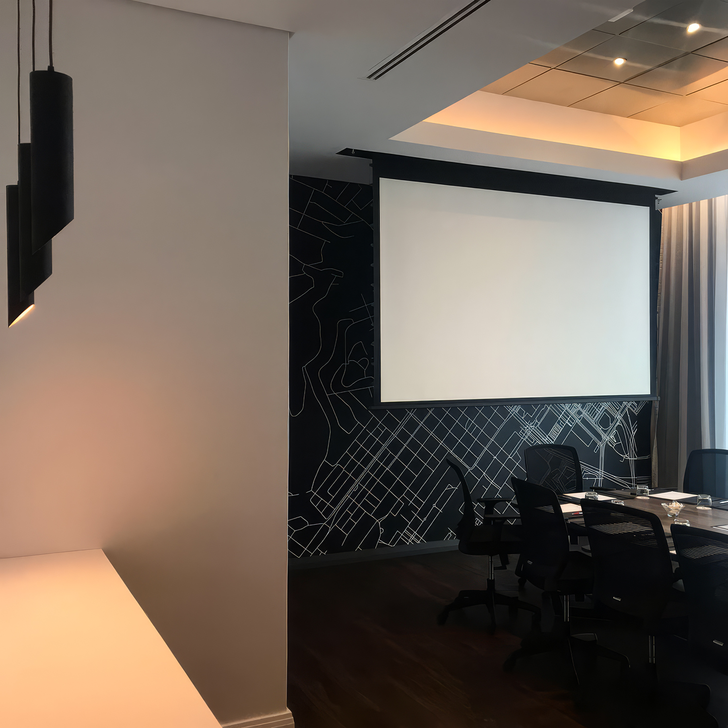
There is no more grounded design decision a corporate boardroom can make than to put its location on the wall. A map mural anchors the room — and by extension the organisation — to its specific place in the world. It is a decision that signals confidence, locality, and reach all at once. The map says: this is where we are, this is the city we operate in, this is the geography we know. For a Cape Town tenant in one of the city’s most prominent corporate addresses, this is wallcovering as a statement of place.


The wallcovering's authority is amplified by the absolute restraint of the room around it. A long dark fumed oak boardroom table, black mesh executive chairs, simple black leather writing pads with red-accent pens at each setting, full-height curtained glazing opening to the city beyond. A recessed coffered ceiling with warm amber cove lighting. Nothing competes with the map. Everything supports it. This is the mark of a designer who understood that when the wallcovering is doing the work of the room, the rest of the design must defer to it.

The most powerful design moment in the room is the relationship between the wallcovering and the windows. The map on the wall depicts the city. The windows show the city. From the boardroom table, the executive sees both at once — the abstracted cartographic representation of the place, and the place itself. The dark mural and the bright daylight from the glazing create a balanced visual tension that gives the room a sense of openness and gravitas in equal measure. The wallcovering is what makes this dialogue possible.

What elevates this installation beyond a generic feature wall is the quality of the line work. The map is rendered in precise, hairline white drawing — a level of cartographic detail that rewards close inspection without ever becoming visually noisy at distance. The wallcovering performs at every scale: as a powerful graphic statement seen from across the room, and as a precise drawing studied close-up while waiting for a meeting to begin. This is what considered wallcovering specification looks like.

The Crystal Towers boardroom demonstrates the full strategic value of wallcovering in corporate environments. Supplied and installed by WCI Wall Coverings, this custom map mural transforms what could have been a standard executive boardroom into a space that communicates locality, confidence, and design intelligence the moment a client walks in. The wall is never background in a project of this calibre. Here, it is the entire reason the room works


CREDITS
Location: Cape Town