When Corporate Identity Becomes Architecture
The finest commercial interiors don't apply a brand to a space. They build the brand into the space. In this corporate office fitout by Xperience Makers, the organisation's entire visual identity — the networks, the nodes, the data flows, the leaf motif — is not decoration hung on the walls after the architecture was finished. It is the architecture. And wallcovering is the material that makes this complete integration possible.
The reception feature wall is the project's opening statement. A custom network node wallcovering — pale grey-ivory ground with a delicate web of interconnected lines and circular node points — covers the full surface. Across the pattern, a ribbon of scrolling binary code flows diagonally in soft grey, and the client's leaf-stem icon marks the key nodes within the network. This is the brand's visual system expressed as architecture. At reception scale, the wallcovering doesn't decorate the space — it tells every visitor exactly who this organisation is and what they do, before a word is spoken.
In the staff kitchen and café zone, the same network visual language returns in an entirely different tonal register. A deep warm grey-mauve ground carries bold white network geometry at a much larger scale — triangular mesh forms with generous white node points reading almost as constellations. The quiet precision of the reception gives way here to a more graphic, more atmospheric, more dynamic version of the same design DNA. Two wallcoverings, one brand, two different moods — across two different zones that ask for different things of their inhabitants.
What elevates this project above the ordinary is that the wallcovering is not a standalone gesture. The same network line geometry that runs across the walls is inlaid directly into the warm oak reception desk front, the kitchen island, and the side joinery returns. The pattern travels. It moves from wall to furniture to wall in a continuous architectural conversation. Xperience Makers has achieved what most commercial fitouts only gesture toward — a genuinely integrated design language where every surface speaks the same visual truth.
Growing up through the reception and open-plan zones are a series of stylised sculptural tree forms — in white and warm timber — that echo the organic "growth" of the network pattern and the leaf motif embedded in the brand's logo. The trees are not ornamental. They are wayfinding devices, spatial organisers, and physical expressions of the same brand philosophy the wallcoverings carry. Together, the walls and the trees and the joinery form a complete environmental identity. The brand is not on the space. It is the space.
What Xperience Makers has delivered at this project is a masterclass in integrated commercial design. Every material decision, every custom element, every wallcovering choice reinforces a single coherent identity for the organisation that inhabits the space. This is not interior design applied to a brand — this is brand architecture realised through interior design. The wallcovering is the largest and most visible expression of this integration, but it succeeds because every decision around it was made with the same rigour and the same reference to the same core idea.
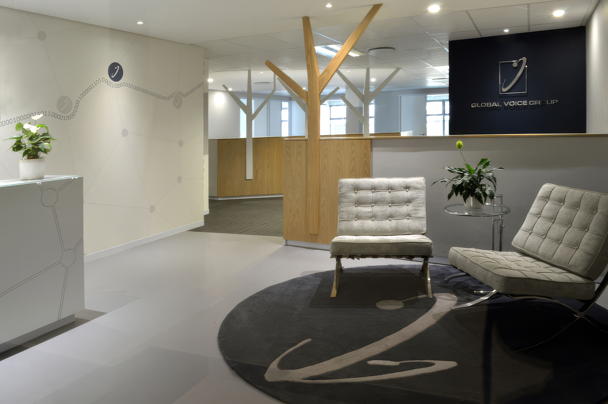
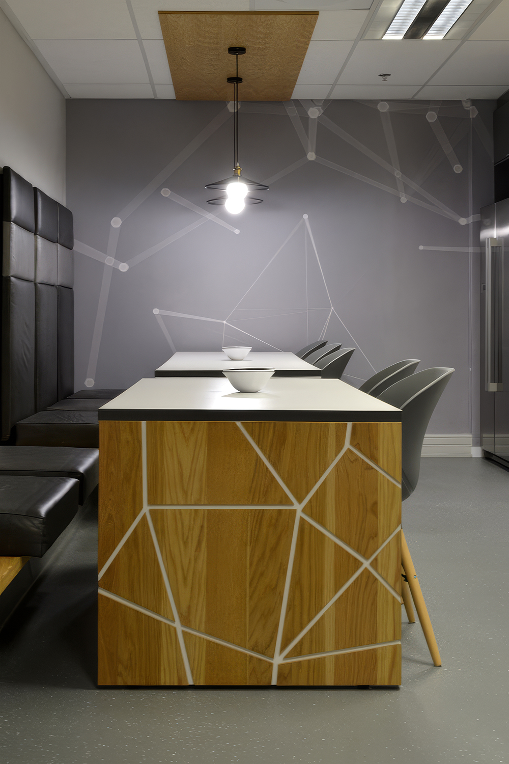
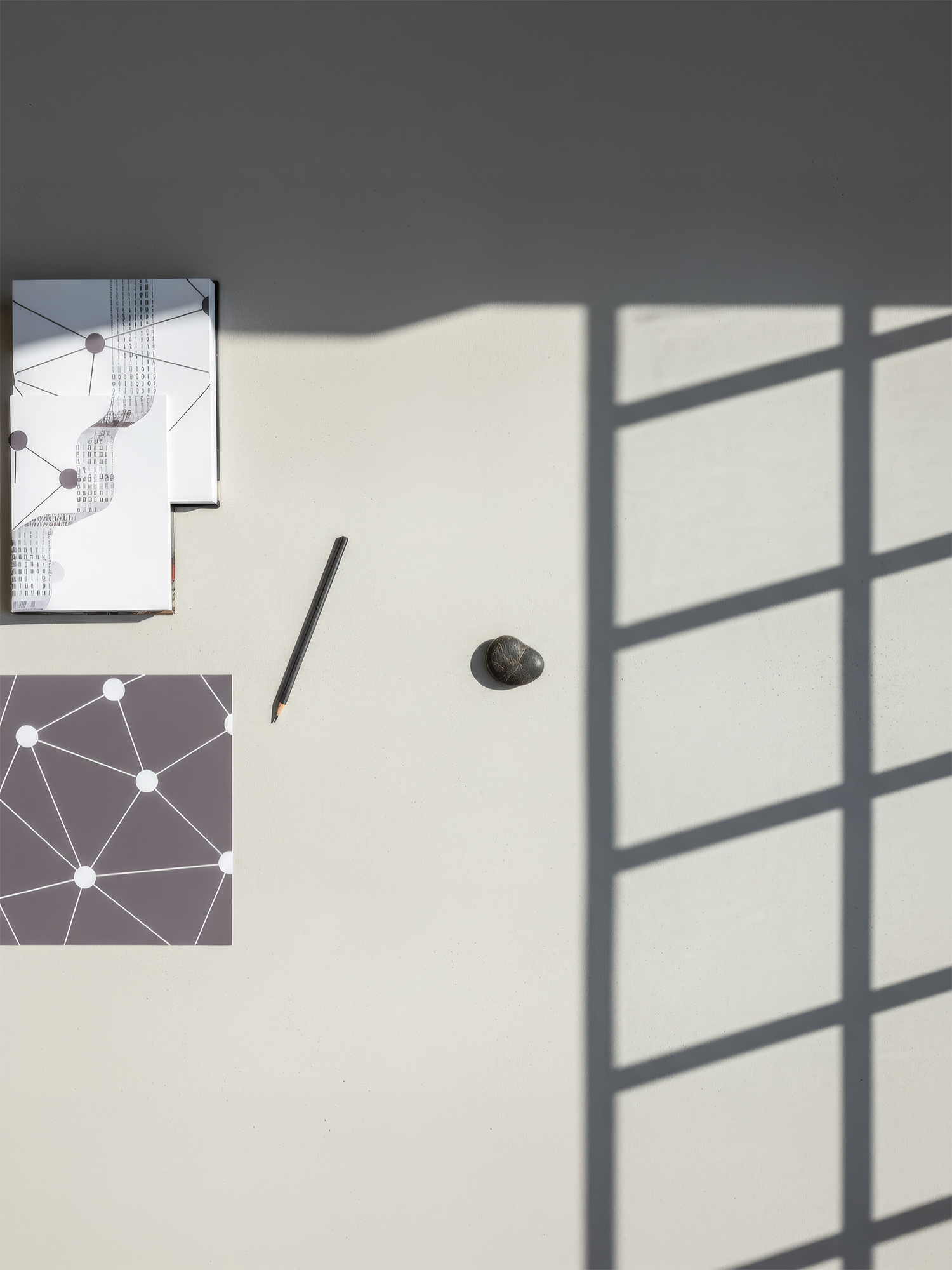
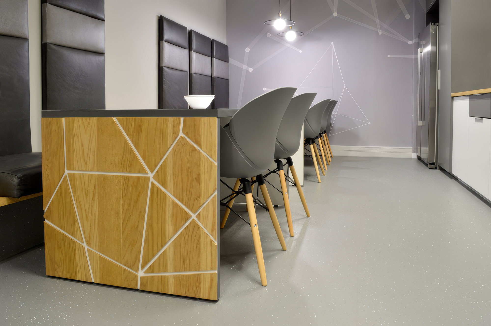
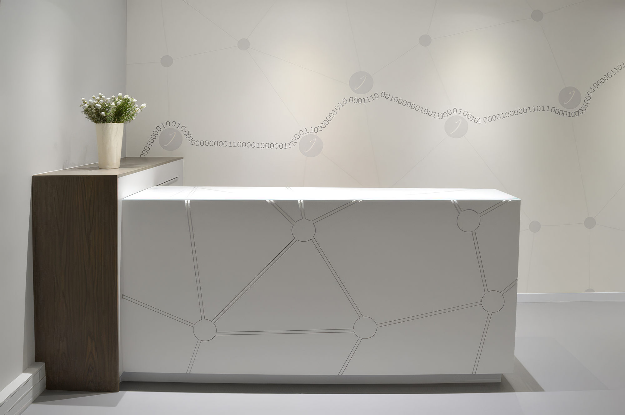
This project demonstrates what custom wallcovering can achieve in commercial environments when a designer thinks beyond the wall. Supplied and installed by WCI Wallpapers across the reception, kitchen, and key feature zones, these bespoke designs show that wallcovering is not a finishing decision — it is a foundational one. When the wall becomes the brand, when the brand becomes the architecture, when every surface speaks the same language, the result is an interior that cannot be mistaken for any other. The wall is never background here. It is the entire identity.
