When the Wall Becomes the Brand

Not every interior needs to whisper. Some spaces are built to speak at full volume — to communicate the energy, the personality, and the ambition of the organisation that inhabits them the moment you walk through the door. LimeBlock, realised by Urban Spaces, is one of those interiors. And at the centre of its design language, doing the loudest and most considered work in the room, is the wall.

In the main breakout zone, a large custom mural wallcovering covers the full feature wall in a composition that is equal parts graphic design and interior architecture. Bold typographic letterforms scatter across the surface alongside large concentric circle target forms, a central leaf motif, and dynamic geometric colour blocks — all in the clients signature palette of lime green, teal, dark charcoal, and white. This is not a wallcovering that happens to match the brand. It is the brand — translated from identity to architecture, from screen to surface, at full scale.

What Urban Spaces understood in designing this space is that colour at this scale requires absolute conviction. Half measures produce chaos. Total commitment produces energy. The mural’s palette — multiple greens from lime to deep teal, black, white, and cool blue — holds together because every decision within it was made as part of a system. The result is a wall that reads as designed rather than decorated. It gives the breakout zone an identity that is instantly recognisable and completely owned.


At the entry and reception zone, a second wallcovering moment announces the organisation's character before a word is spoken. A large-scale pop-art inspired graphic mural — bold, irreverent, and unmistakably human — sets the tone with confidence. Against an exposed concrete ceiling with industrial ductwork, a cluster of sculptural white paper pendant lights, and polished concrete floors traced with lime green line detail, the mural wallcovering is the warmest and most communicative surface in the room. It tells you exactly what kind of organisation you are about to encounter.

Throughout the offices, Urban Spaces has created an environment where the wallcovering decisions are not isolated moments — they are part of a complete design language that runs from the floor tape to the pendant lights to the lime green upholstery. The brand colour system permeates every surface and every object. The wallcoverings are the most powerful expressions of that system because they operate at the largest scale, but they succeed because everything around them is in conversation with them. This is integrated design at its most energetic.

What Urban Spaces demonstrates here is a design practice that understands its client's culture deeply enough to translate it into physical space. The wallcovering choices here are not speculative — they are specific. They could only belong to this organisation, in this space, with this brief. That specificity is the mark of a designer who listened before they drew. The wall tells you who these people are. That is the highest function any surface can perform.

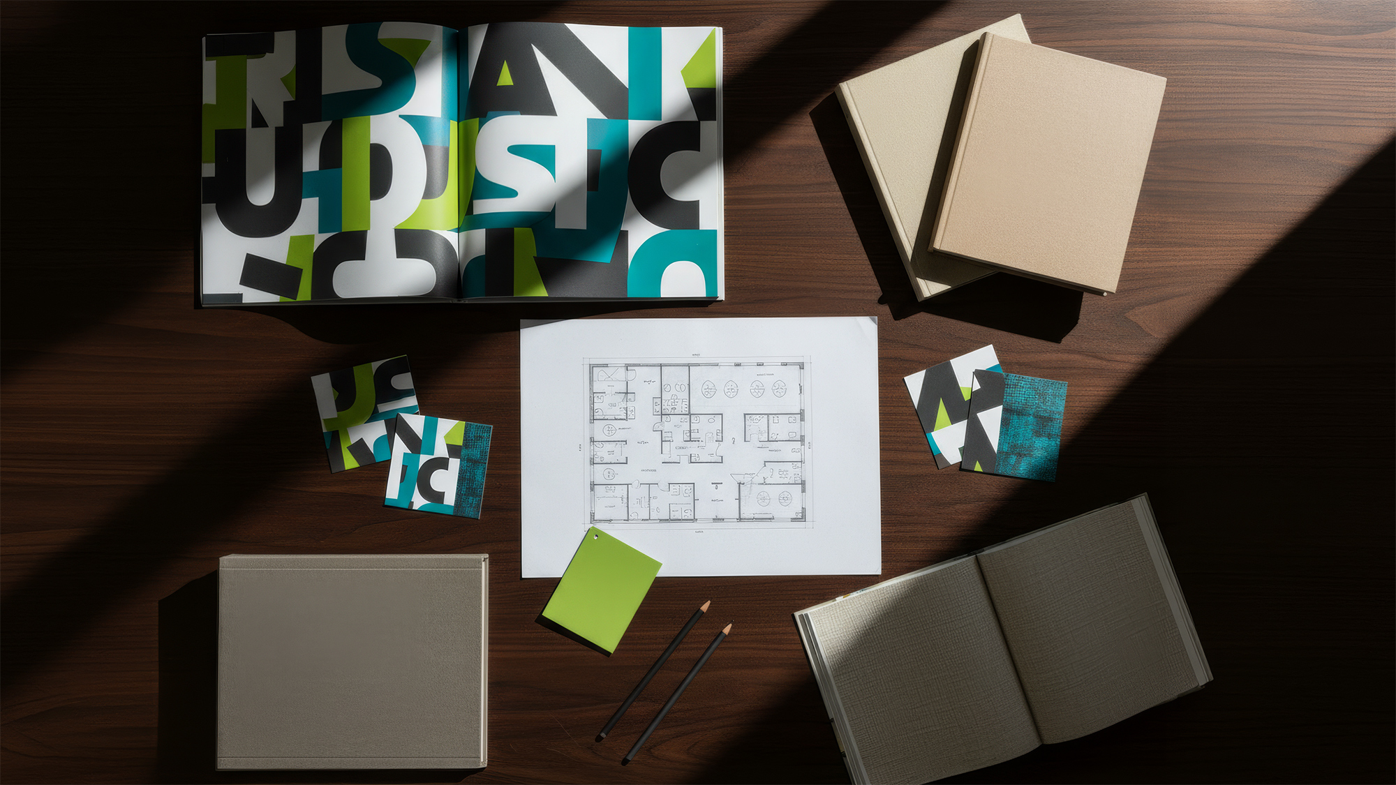
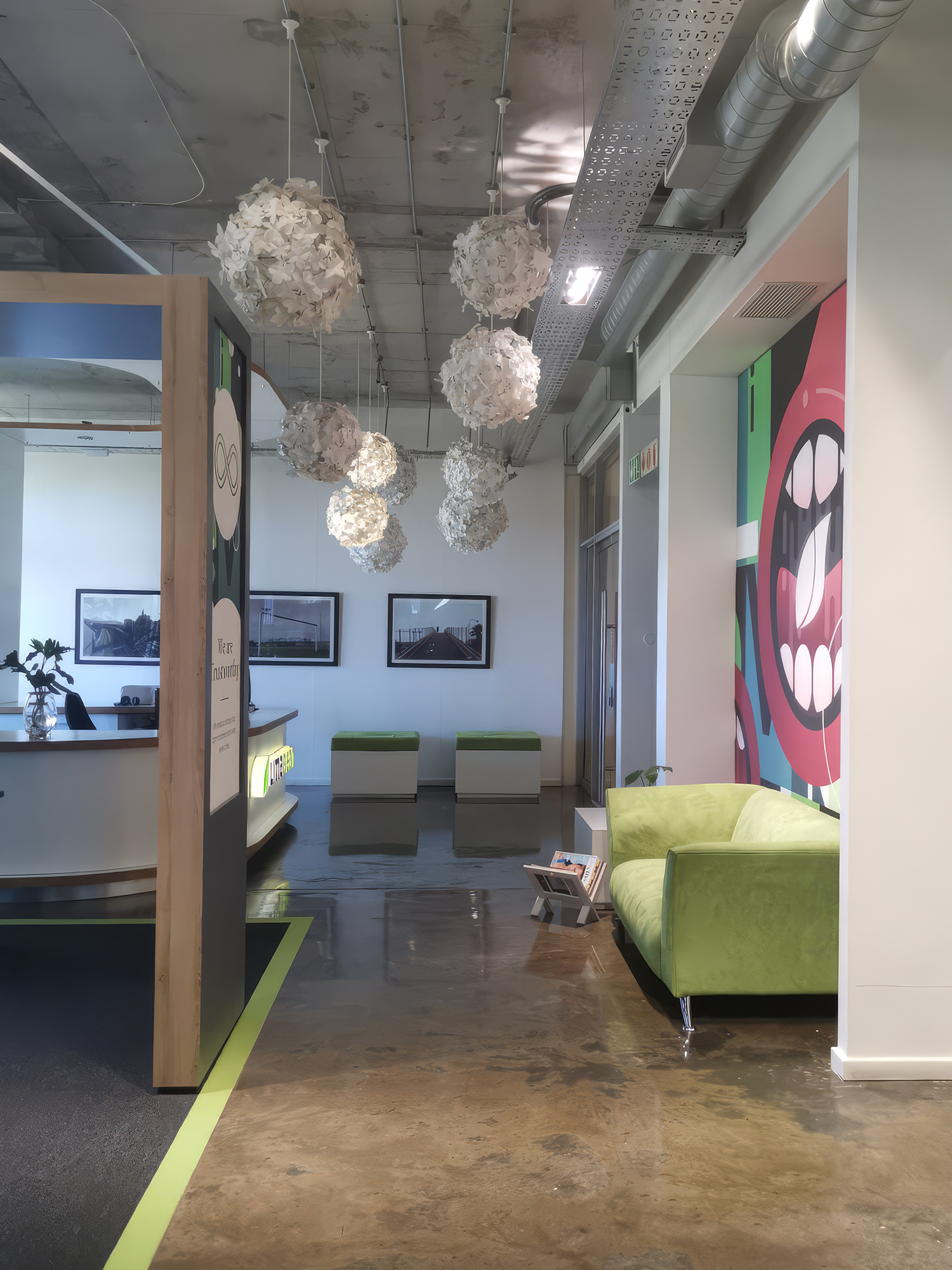
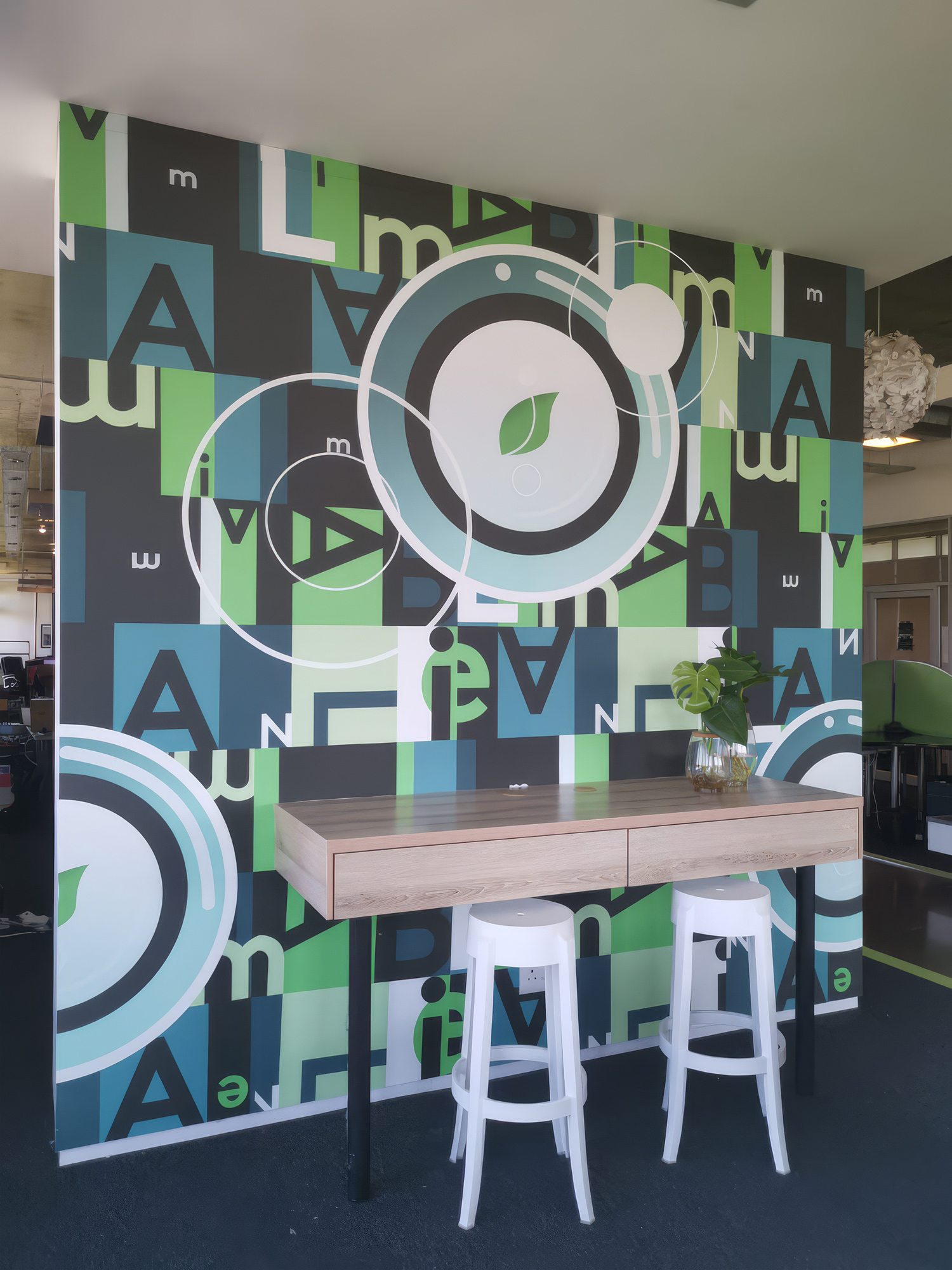
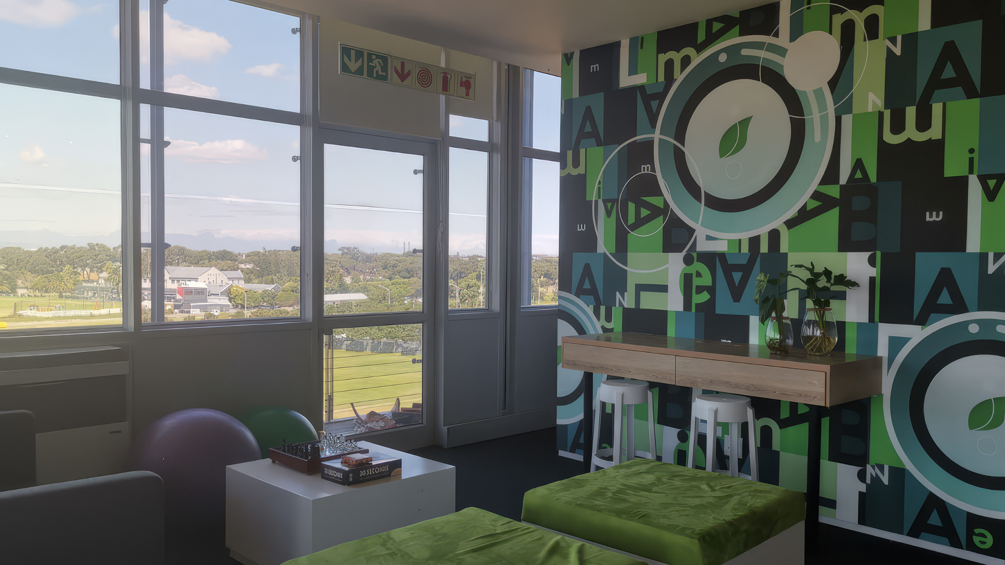
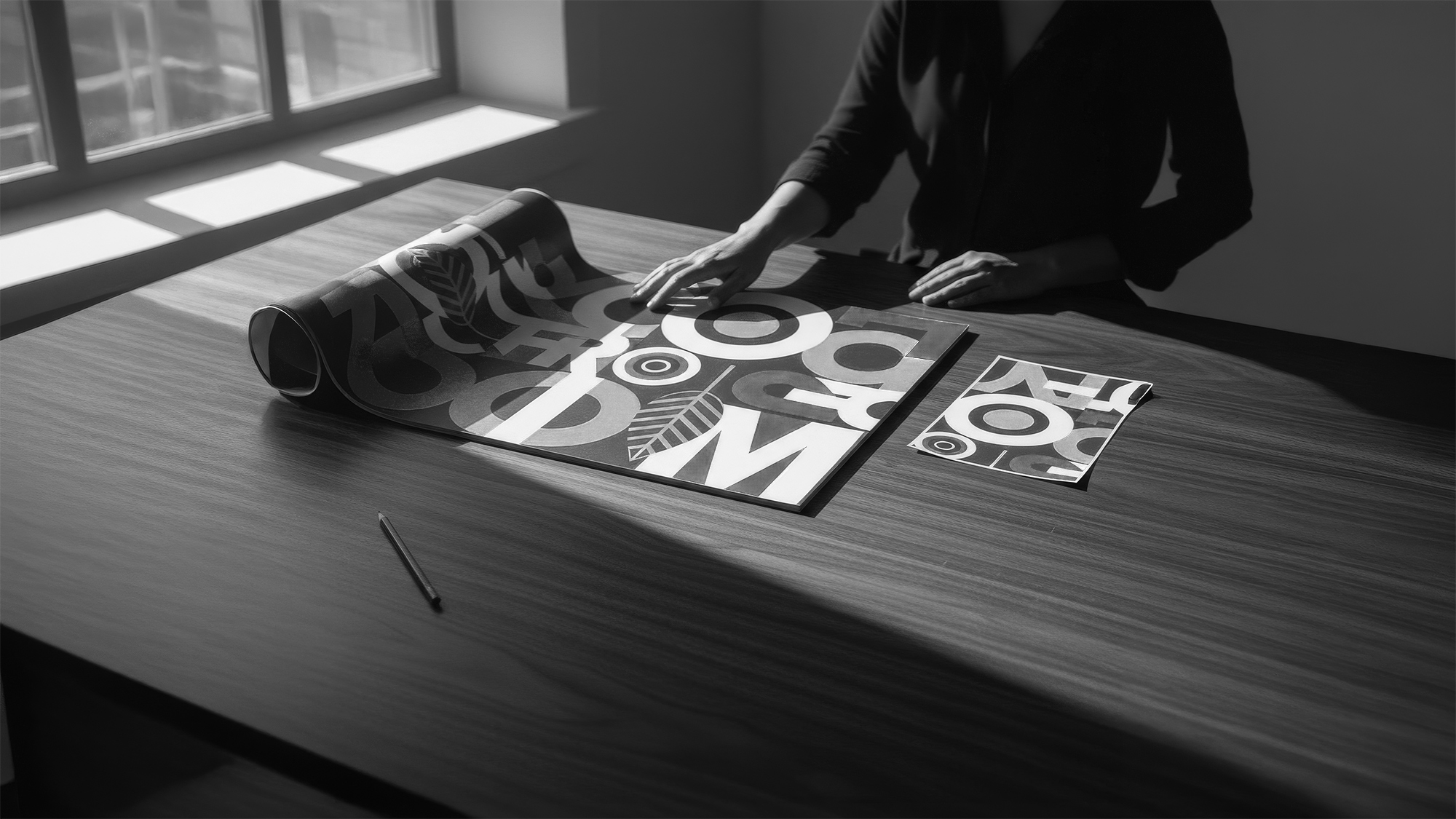
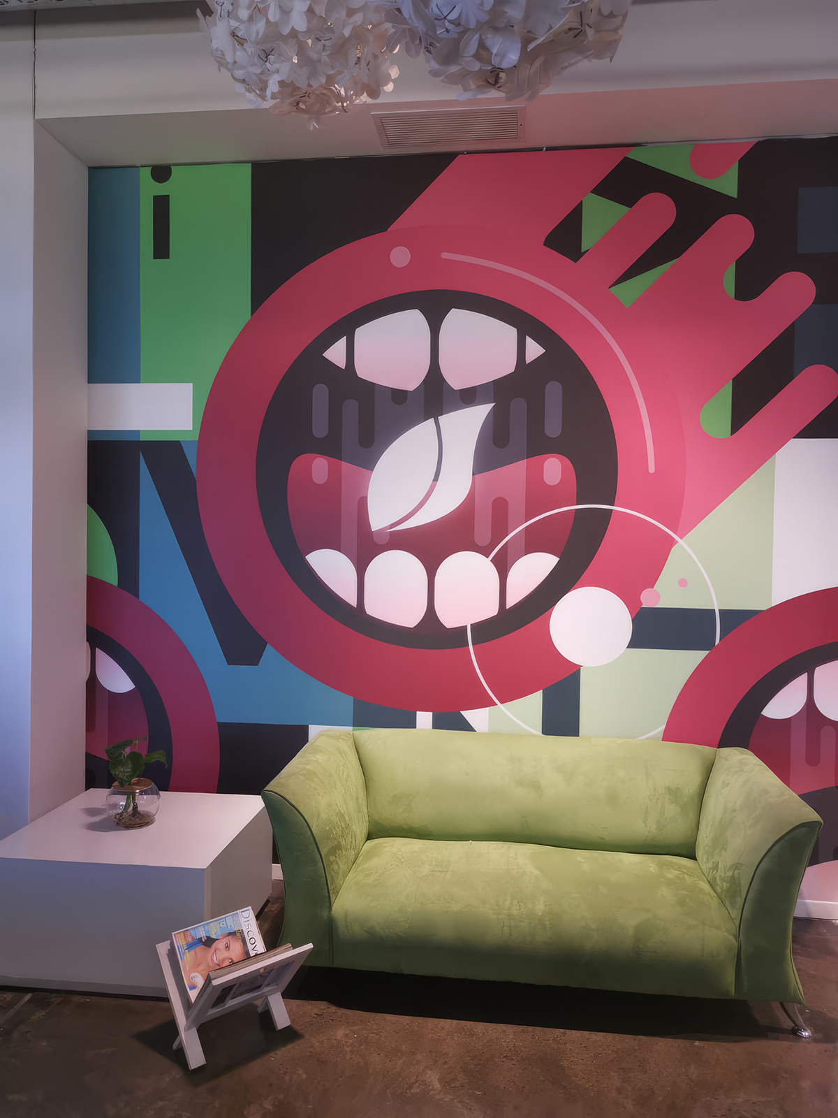
This project demonstrates that wallcovering is as powerful a tool in bold, branded commercial environments as it is in the most refined residential interiors. Supplied and installed by WCI Wallpapers, the custom mural installations at these offices prove that the right surface — designed with intention, installed with precision, and rooted in a genuine understanding of who the space belongs to — can make a wall the most communicative element in any room. The wall is never background here. For this company, it is the voice.

CREDITS
Location: Cape Town
Photos Courtesy of Urban Spaces
Designer: Urban Spaces