
Surface as Story: The Wallcovering Design Programme at The Vineyard Hotel
There is a particular quality of attention that separates a truly considered hotel from one that is merely comfortable. At The Vineyard Hotel in Newlands, that quality announces itself in the walls — in the decision, room by room and space by space, to treat surface not as painted finish but as designed experience. Across guest rooms, suites, and public spaces, a cohesive wallcovering programme moves between historical landscape, raw natural texture, and vivid botanical drama. The result is an interior that feels both deeply South African and genuinely world-class: a property where every room tells a different chapter of the same story, and the walls are where that story begins.
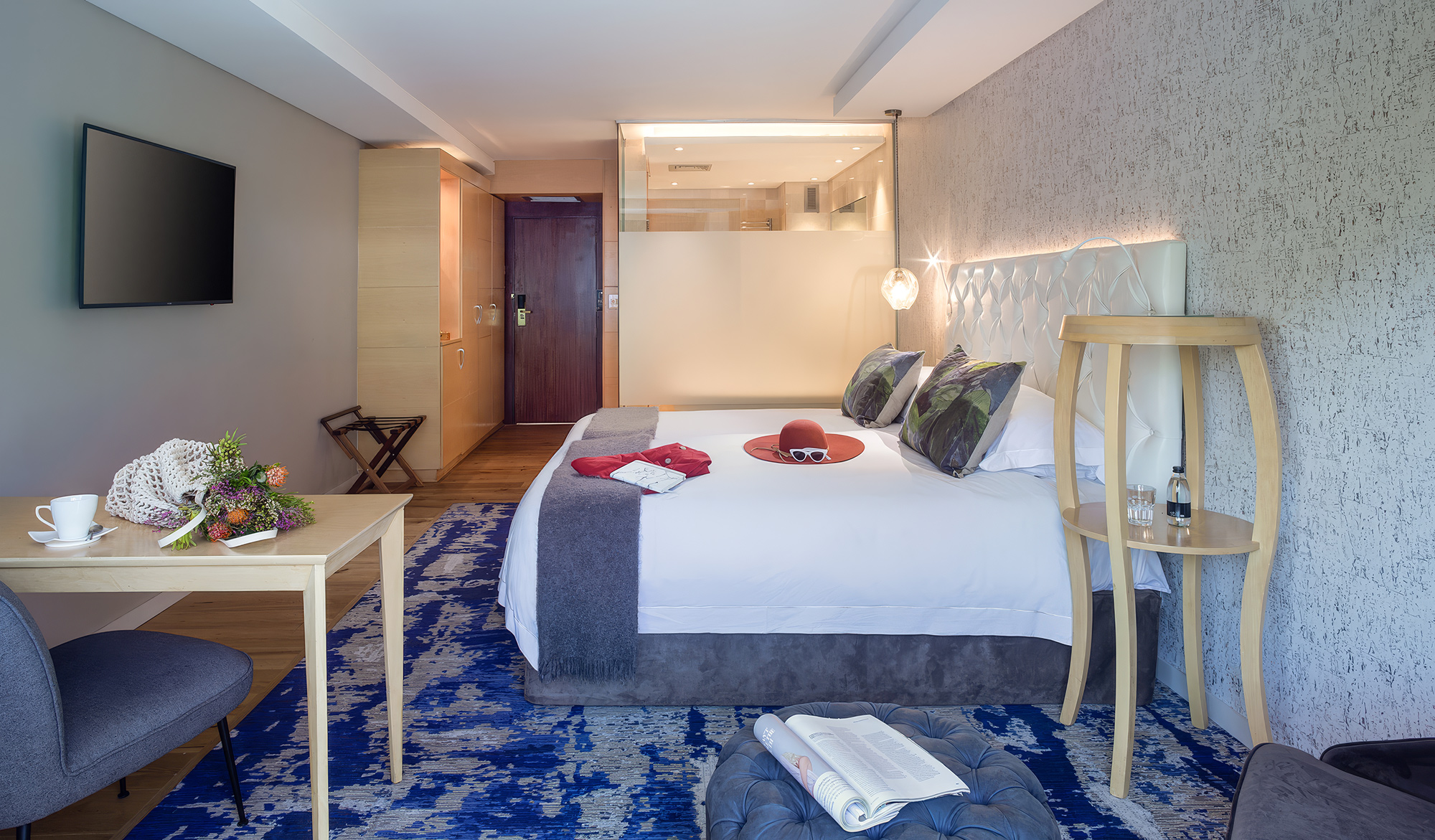
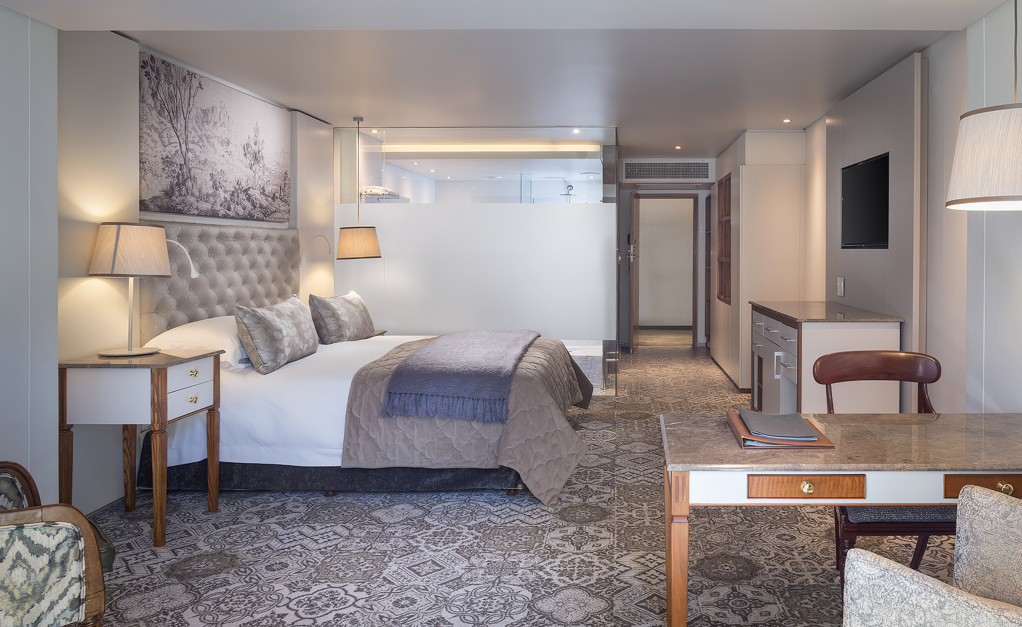
In the hotel's superior rooms, the wall above the bed carries a single, precisely positioned mural panel — a monochromatic landscape in silver-grey and blue-grey tones, depicting classical European scenery in the tradition of eighteenth-century scenic panoramic wallcovering. Trees, hills, a distant architectural ruin: the image is calm, contemplative, entirely unhurried. Against the grey velvet headboard and the silver quilted bedcover below it, the panel reads at first as a framed artwork. On closer attention, it reveals itself as the wall itself — a surface decision that gives the room its focal point, its scale reference, and its emotional tone all at once. The geometry of the installation is immaculate: the panel is contained within the room's architectural reveal, becoming part of the architecture. The wall is never background here.
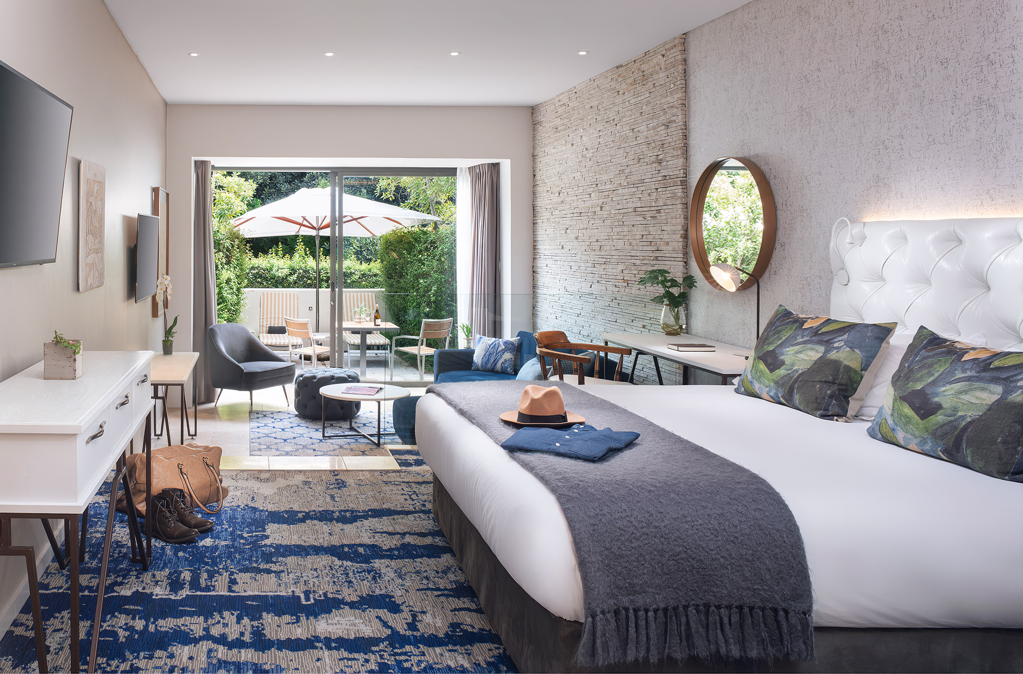
The garden suites take a different approach entirely. Here, the feature wall behind the bed is dressed in a richly textured wallcovering that reads — convincingly, arrestingly — as dry-stack pale quartzite or natural ledger stone. Horizontal bands of cream, warm grey, and ivory build into a surface that has genuine visual weight and depth, the impression of something excavated rather than applied. Against a white tufted leather headboard and the greenery of a private courtyard beyond the sliding doors, this wall creates the sensation of a room that has grown from the garden rather than been built beside it. The craft in specifying a wallcovering of this quality — one that earns the comparison to natural stone without pretending to be it — is considerable. This is material intelligence expressed as surface.
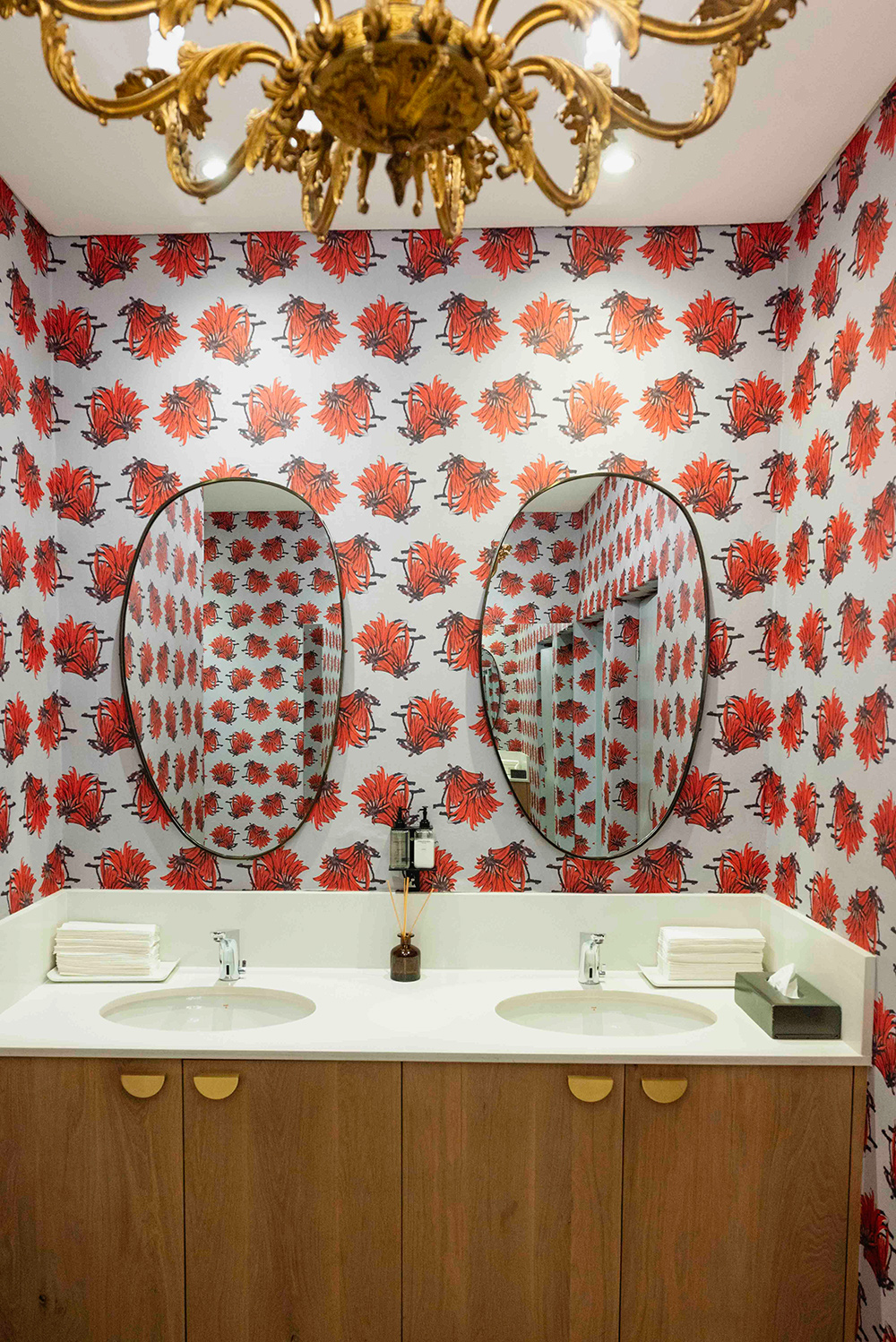
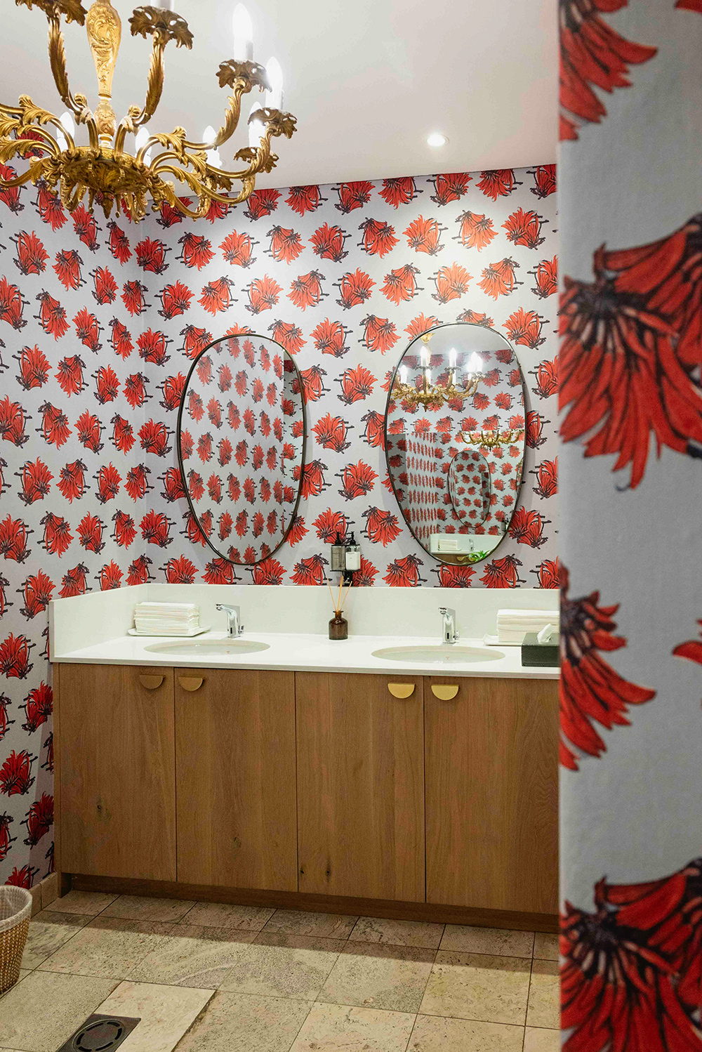
If the guest rooms speak quietly, the powder room speaks at full volume — and earns every decibel. The walls are wrapped in a bold botanical repeat of red fynbos flowers: large-scale, loosely drawn, gestural renderings of what appears to be the red disa or a protea-adjacent bloom, each cluster vivid scarlet and deep graphite-black against a pale grey-white ground. The pattern runs floor to ceiling, corner to corner, wrapping around every wall and return surface in a total envelope that makes the small room feel both intimate and theatrical. Above, a baroque gilded chandelier — all scrolling gold leaf and candlelight — introduces a note of inherited grandeur that the wallcovering both absorbs and amplifies. Two oval black-framed mirrors multiply the pattern into apparent infinity. This is the kind of powder room that guests photograph, describe, remember. It is also an act of design confidence that few hospitality projects attempt and fewer execute successfully.
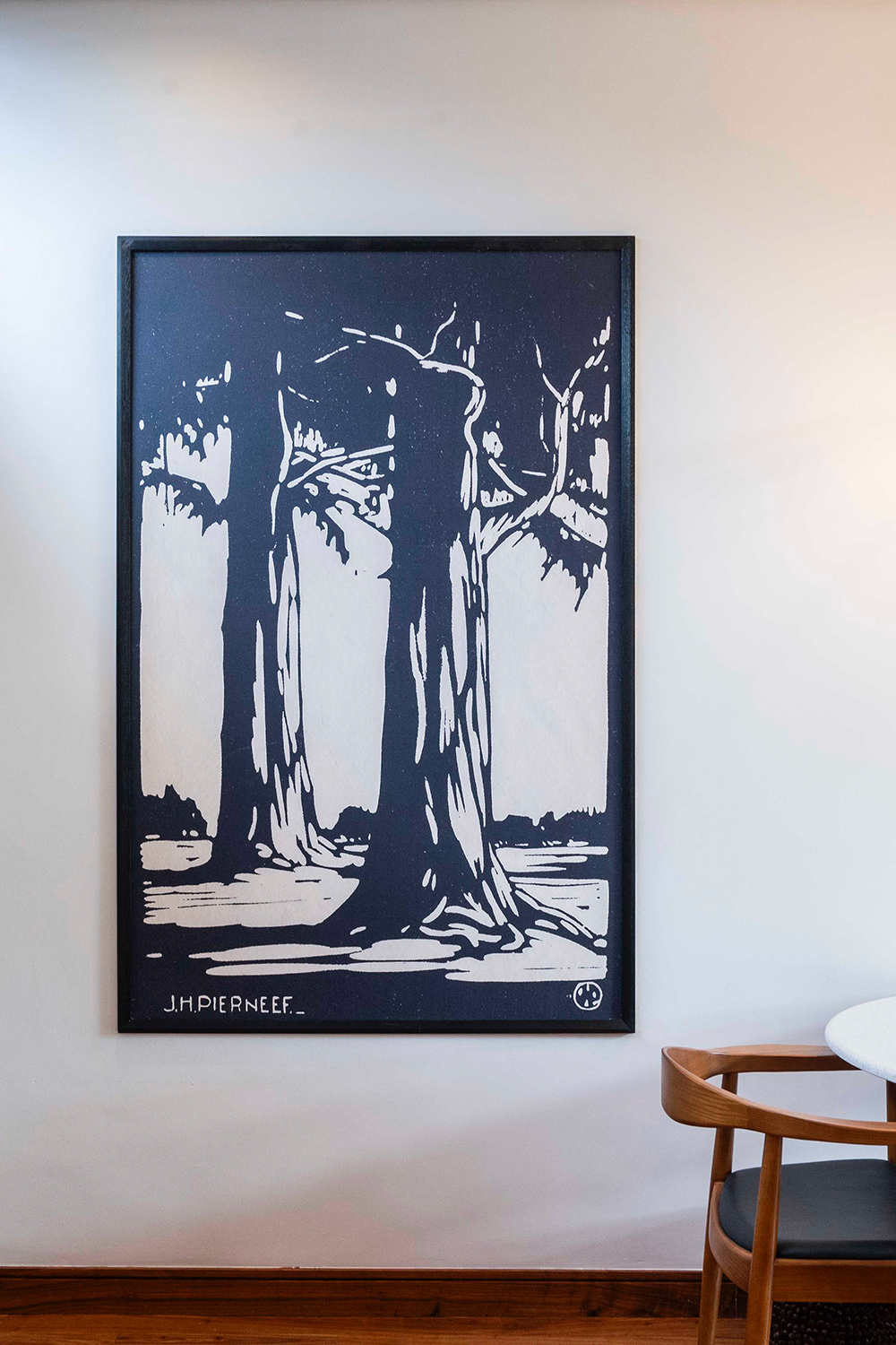
Running alongside the wallcovering programme is a commitment to South African visual culture that deepens the hotel's sense of place. The corridors and public spaces carry large-format reproductions of J.H. Pierneef's linocuts — bold, graphic, tonally severe interpretations of the South African landscape in black and cream. Against plain white walls, these works hold their own without competing. They establish an artistic register that the wallcovering selections honour: both the scenic mural panel and the fynbos botanical are, in their different ways, landscape as surface — the same instinct that drove Pierneef's work, translated into contemporary material. A hotel that understands this relationship between art and interior is one that understands what hospitality is actually for.
The Vineyard Hotel's wallcovering programme works because it respects a clear colour logic. The guest rooms are intentionally restrained — grey landscape panels, stone-toned textured walls, cool blue and cream throughout. The palette is sophisticated precisely because it asks very little of the eye. Then the powder room arrives, in scarlet and graphite and gilded baroque, and the release is complete. This rhythm — quiet, quieter, then bold — is not accidental. It is the result of a design intelligence that understands contrast as a compositional tool: that the red fynbos blooms are more vivid, more alive, more joyful because the rooms that precede them have been so deliberately still. The architecture of atmosphere requires patience as much as drama.
What distinguishes The Vineyard Hotel’s interior is that the wallcovering decisions were made as a programme — a coherent series of choices across room types and public spaces that share a sensibility without sharing a design. Each zone has its own visual language; each language is native to its function. The scenic mural belongs above a bed. The stone texture belongs in a garden suite. The fynbos botanical belongs in a powder room that guests will talk about over dinner. WCI Wallpapers supplied and installed the full wallcovering programme across the property — a project that demonstrates the depth of thought and quality of execution that a prestigious hospitality address demands and deserves.